Matko Peckay Furniture

Matko Peckay at home in his workshop in Ossining, N.Y. Phil Mansfield photo.

[av_slideshow_full size=’no scaling’ stretch=” animation=’fade’ autoplay=’false’ interval=’5′ control_layout=’av-control-default’ src=” attachment=” attachment_size=” position=’top left’ repeat=’no-repeat’ attach=’scroll’]
[av_slide_full slide_type=’image’ id=’60583′ video=” mobile_image=” video_format=” video_ratio=” title=’Matko Peckay Furniture’ custom_title_size=’48’ custom_content_size=’20’ caption_pos=’caption_center’ link_apply=” link=’lightbox’ link_target=” button_label=” button_color=’light’ link1=’manually,http://’ link_target1=” button_label2=” button_color2=’light’ link2=’manually,http://’ link_target2=” font_color=’custom’ custom_title=’#ffffff’ custom_content=’#020202′ overlay_enable=’aviaTBaviaTBoverlay_enable’ overlay_opacity=’0.1′ overlay_color=’#444444′ overlay_pattern=” overlay_custom_pattern=”]
BY NATASHA THOMSEN
[/av_slide_full]
[/av_slideshow_full]

[av_textblock size=” font_color=’custom’ color=’#ffffff’]

Chair in maple. Anja Hinrichsen photo.

[/av_textblock]

[av_section min_height=” min_height_px=’500px’ padding=’default’ shadow=’no-border-styling’ bottom_border=’no-border-styling’ id=” color=’main_color’ custom_bg=’#f2f2f2′ src=” attachment=” attachment_size=” attach=’scroll’ position=’top left’ repeat=’no-repeat’ video=” video_ratio=’16:9′ overlay_opacity=’0.5′ overlay_color=” overlay_pattern=” overlay_custom_pattern=”]

[av_one_full first min_height=” vertical_alignment=’av-align-top’ space=” margin=’0px’ margin_sync=’true’ padding=’10px,20px,10px,20px’ border=’1′ border_color=’#eaeaea’ radius=’0px’ radius_sync=’true’ background_color=’#ffffff’ src=” attachment=” attachment_size=” background_position=’top left’ background_repeat=’no-repeat’]

[av_hr class=’invisible’ height=’30’ shadow=’no-shadow’ position=’center’ custom_border=’av-border-thin’ custom_width=’50px’ custom_border_color=” custom_margin_top=’30px’ custom_margin_bottom=’30px’ icon_select=’yes’ custom_icon_color=” icon=’ue808′ font=’entypo-fontello’]

[av_textblock size=” font_color=” color=”]

To Matko Peckay, wood causes a contagious feeling that leads to a work of art or something functional, often both.

[/av_textblock]

[av_hr class=’invisible’ height=’30’ shadow=’no-shadow’ position=’center’ custom_border=’av-border-thin’ custom_width=’50px’ custom_border_color=” custom_margin_top=’30px’ custom_margin_bottom=’30px’ icon_select=’yes’ custom_icon_color=” icon=’ue808′ font=’entypo-fontello’]

[av_textblock size=’16’ font_color=’custom’ color=’#686868′]

Matko Peckay at home in his workshop in Ossining, N.Y. Phil Mansfield photo.

The 58-year-old Slovenian has been creating hand-carved armchairs, rocking chairs, loveseats and tables out of hardwood on and off for over 14 years, turning what is initially thought of as functional into a passionately embedded art form.

A year after moving to New York City in 1997, Peckay and his wife, Jeannette Gerber, settled 35 miles north on a 1-acre property in Westchester County’s Ossining, N.Y. While he pursues his passion one day at a time in his workshop, his wife now has a successful business as a tutor for standardized-test preparation. Taking breaks only to renovate their 125-year-old home and landscape their garden, his mind is on design and creating a new piece ever year.

“I’m stepping back and preparing myself,” said Peckay, in his thick Slovenian accent. Spurred on by an unstoppable urge to work with his hands, he bears no particular message other than the love of what he does and finding the harmony between what he feels and makes a piece “right.”

“We, as people, are different and see things differently. Otherwise, it all would be pretty boring,” he says. Accepting those different approaches means allowing a “live and let live” within woodworking, and yet he has to stay within the limits of what can be done with furniture. “I’m learning to stay open and go through a process.”

Selecting the wood lays the foundation for everything that follows. “The challenge is in finding wood where the grain works, inside as well as outside.” There is also the interplay of thickness and width, which determines which woods are more flexible. Peckay culls through local lumberyards for hardwoods – beech, curly and spotted maple and black walnut among them. He’ll even go to remote warehouses to select the appropriate kiln-dried woods with the straightest grain. He now sparingly uses Swiss pear, which is expensive in the United States.

Born in Ljubljana, Slovenia, formerly Yugoslavia, Matko Peckay made mahogany sailing boats as a young man. He became interested in design while studying mechanical engineering at the Stojna Tehnicna Sola. Following a trip to Scandinavia in the mid-1970s, he began exploring the elegant curves and lines of now-classic Scandinavian furniture designs. His personal mission: to create chairs and tables that are unique, but true to the wood’s nature.

After moving with Jeannette to California in 1983, Peckay pursued his creative path working as a carpenter and artist’s assistant while taking classes in drawing and watercolor at the Academy of Art University, formerly the San Francisco Academy of Art. Being the primary wage earner for the couple at the time, he couldn’t accept the full-time scholarship offered to him.

Rocking Chair. Peckay’s work pays homage to Sam Maloof with the inclusion of curved wooden seats and backs and arched coasters. This chair is 46 inches high by 26 inches wide. Anja Hinrichsen photo.

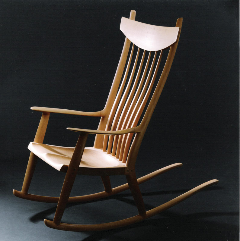
Peckay’s self-taught journey as an artist and woodworker largely mirrors, and was profoundly enhanced by, that of renowned Californian contemporary furniture craftsman Sam Maloof. Of Lebanese descent and known for his signature chairs and trademark rocker, Maloof’s work embodied the modern Danish/Scandinavian lines that Peckay relished. “When I saw Maloof’s work, knew I wanted to make this type of furniture.” To achieve this, he had to hone his drawing skills and took a pencil and charcoal class at the university.

Returning to his wife’s native Switzerland in 1990, Peckay received his first commission in a small village in the outskirts of Zurich, where he worked as a carpenter and leased a loft space in an industrial building occupied by artists and tradesmen. At first, it started out as a barter agreement with a potter for a 10-foot, narrow dining room table in maple. By 1996, the same potter ordered a custom-made double-sided desk. Using his connections with cabinetmaking, Peckay launched himself as a woodworker. He went on to make his first love seat and armchair, followed by a rocking chair and dining room table.
[/av_textblock]

[av_hr class=’invisible’ height=’50’ shadow=’no-shadow’ position=’center’ custom_border=’av-border-thin’ custom_width=’50px’ custom_border_color=” custom_margin_top=’30px’ custom_margin_bottom=’30px’ icon_select=’yes’ custom_icon_color=” icon=’ue808′ font=’entypo-fontello’]

[av_heading heading='”Peckay takes rough-cut wood and selects what will work with the different parts of a chair. He’s familiar enough with the woods to know what colors – from light to reddish brown, or even purple brown – they will produce.”‘ tag=’h3′ style=’blockquote classic-quote’ size=’44’ subheading_active=” subheading_size=’15’ padding=’10’ color=’custom-color-heading’ custom_font=’#020202′][/av_heading]

[av_hr class=’invisible’ height=’50’ shadow=’no-shadow’ position=’center’ custom_border=’av-border-thin’ custom_width=’50px’ custom_border_color=” custom_margin_top=’30px’ custom_margin_bottom=’30px’ icon_select=’yes’ custom_icon_color=” icon=’ue808′ font=’entypo-fontello’]

[av_textblock size=’16’ font_color=’custom’ color=’#686868′]
“Chairs are my passion,” he declares. He also has a yen for rockers with long wings and curved backs. A serendipitous encounter with the elderly Sam Maloof in 2001 at the Renwick gallery in Washington, D.C., led to a one-day workshop at the master’s studio in Alta Loma, Calif. Peckay was captivated by how even an armrest shaped out of solid wood respected the flow of lines. “I could see 60 years of experience at the core of his designs.”

Peckay takes the rough-cut wood and selects what will work with the different parts of a chair. He’s familiar enough with the woods to know what colors – from light to reddish brown, or even purple brown – they will produce. Front legs need very straight grains to carry the weight and support the armrest. After hand-carving the different components, he assembles and glues the pieces together, filing them down with handmade rasps from France and doweling them together. He sands and finishes with oil and wax. He may spend upward of 350 hours to create a single armchair, a justification for the minimum $6,700 he asks for one chair.

Loveseat. Carefully molded seats, gently arched back and perfectly proportioned arms. The loveseat is 34½ inches high by 48½ inches wide by 24 inches deep. Anja Hinrichsen photo.

With a recent order destined for Aspen, Colo., Peckay was challenged with selecting and preparing wood for four matching black walnut chairs that all needed to be of the same proportions. He also discovered the importance of “zooming in and out” of his pieces. “It’s very important to see a chair from afar, to move from micro to macro.”

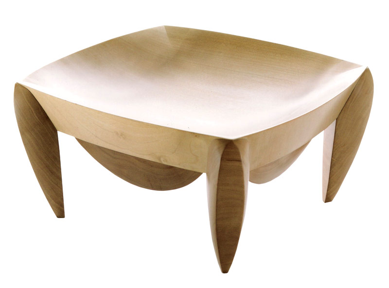
Peckay says that, while the physical demands of woodworking are stressful to his shoulders, he also finds it necessary to allow his mind time to relax, “otherwise, I get too focused and trapped in the repetitive phase of working each piece.” Three years ago, he began crafting wooden bowls and creating small sculptures from a variety of maples, black walnut, myrtle wood burl and ash. Peckay has found that working on smaller items allows him to “free mold and shape as I go.”

Matko Peckay’s clients include private residents in Westchester, interior designers and architects. His “circle of admirers” includes people who are “in the profession and appreciate my efforts and value what goes into each part of a furniture.”

Group exhibits and furniture shows are another source of encouragement. At the prestigious Philadelphia Invitational Furniture Show in 2005 and 2006, his work caught the eye of acclaimed furniture designer Mira Nakashima, daughter of the late Japanese-American furniture designer and craftsman George Nakashima. She invited Matko and Jeannette to take a private tour of the famous Nakashima studios in New Hope, Pa.

Bowl, 2006. Anja Hinrichsen photo.

Every spring for the past five years, the Peckays have transformed their living room area into a three-day arts and crafts salon. Here, area artisans join them in presenting their photography, jewelry and paintings in a relaxed atmosphere that is attended by a growing e-mail list of people.

These days, Peckay cultivates commissions both nationally and locally. His goal: to make his work known to those who can appreciate his personal quest to go with the grain. And it’s not uncommon for a client to visit his workshop for a “sitting,” as was the case for a very dear 93-year-old customer who is only 5 feet tall.

Make an appointment to visit Peckay’s showroom: 914-945-0706.
[/av_textblock]

[/av_one_full][/av_section][av_hr class=’invisible’ height=’50’ shadow=’no-shadow’ position=’center’ custom_border=’av-border-thin’ custom_width=’50px’ custom_border_color=” custom_margin_top=’30px’ custom_margin_bottom=’30px’ icon_select=’yes’ custom_icon_color=” icon=’ue808′ font=’entypo-fontello’]

[av_one_fifth first min_height=” vertical_alignment=” space=” custom_margin=” margin=’0px’ padding=’0px’ border=” border_color=” radius=’0px’ background_color=” src=” background_position=’top left’ background_repeat=’no-repeat’][/av_one_fifth]

[av_four_fifth min_height=” vertical_alignment=” space=” custom_margin=” margin=’0px’ padding=’0px’ border=” border_color=” radius=’0px’ background_color=” src=” background_position=’top left’ background_repeat=’no-repeat’]
[av_sidebar widget_area=’SCM – 728×90 – footer’]
[/av_four_fifth]

Lino Tagliapietra

Lino Tagliapietra in his Murano studio around 1998. Photo by Francesco Barasciutti.

[av_slideshow_full size=’no scaling’ stretch=” animation=’fade’ autoplay=’false’ interval=’5′ control_layout=’av-control-default’ src=” attachment=” attachment_size=” position=’top left’ repeat=’no-repeat’ attach=’scroll’]
[av_slide_full slide_type=’image’ id=’60590′ video=” mobile_image=” video_format=” video_ratio=” title=’Lino Tagliapietra’ custom_title_size=’48’ custom_content_size=’20’ caption_pos=’caption_center’ link_apply=” link=’lightbox’ link_target=” button_label=” button_color=’light’ link1=’manually,http://’ link_target1=” button_label2=” button_color2=’light’ link2=’manually,http://’ link_target2=” font_color=’custom’ custom_title=’#ffffff’ custom_content=’#ededed’ overlay_enable=’aviaTBaviaTBoverlay_enable’ overlay_opacity=’0.1′ overlay_color=’#444444′ overlay_pattern=” overlay_custom_pattern=”]
BY KARLA KLEIN ALBERTSON
[/av_slide_full]
[/av_slideshow_full]

[av_textblock size=” font_color=’custom’ color=’#ffffff’]

Mandara. Blown glass with multiple incalmi and criss-crossed canes, recent work that demonstrates Tagliapietra’s creative vigor.
It was made using the multi-step Pilchuk ‘96 technique that produces lines of color running through the object.
Photo by Russell Johnson. Courtesy Renwick Gallery/Smithsonian Images

[/av_textblock]

[av_section min_height=” min_height_px=’500px’ padding=’default’ shadow=’no-border-styling’ bottom_border=’no-border-styling’ id=” color=’main_color’ custom_bg=’#f2f2f2′ src=” attachment=” attachment_size=” attach=’scroll’ position=’top left’ repeat=’no-repeat’ video=” video_ratio=’16:9′ overlay_opacity=’0.5′ overlay_color=” overlay_pattern=” overlay_custom_pattern=”]

[av_one_full first min_height=” vertical_alignment=’av-align-top’ space=” margin=’0px’ margin_sync=’true’ padding=’10px,20px,10px,20px’ border=’1′ border_color=’#eaeaea’ radius=’0px’ radius_sync=’true’ background_color=’#ffffff’ src=” attachment=” attachment_size=” background_position=’top left’ background_repeat=’no-repeat’]

[av_hr class=’invisible’ height=’30’ shadow=’no-shadow’ position=’center’ custom_border=’av-border-thin’ custom_width=’50px’ custom_border_color=” custom_margin_top=’30px’ custom_margin_bottom=’30px’ icon_select=’yes’ custom_icon_color=” icon=’ue808′ font=’entypo-fontello’]

[av_textblock size=” font_color=” color=”]

Italian designer Lino Taglipietra (b. 1934) emerged from the traditional Venetian glass workshops in Murano to become a catalyst for innovation in the international studio glass movement.

[/av_textblock]

[av_hr class=’invisible’ height=’30’ shadow=’no-shadow’ position=’center’ custom_border=’av-border-thin’ custom_width=’50px’ custom_border_color=” custom_margin_top=’30px’ custom_margin_bottom=’30px’ icon_select=’yes’ custom_icon_color=” icon=’ue808′ font=’entypo-fontello’]

[av_textblock size=’16’ font_color=’custom’ color=’#686868′]

Lino Tagliapietra in his Murano studio around 1998. Photo by Francesco Barasciutti.

In 2009, the Smithsonian’s Renwick Gallery in Washington, D.C.,  presented an exhibition titled Lino Tagliapietra in Retrospect: A Modern Renaissance in Italian Glass. It brought  together 140 examples ranging from simple early pieces to brilliantly complex works.

Tagliapietra is an artist who has increased in creative power over six decades. Already a maestro in Venice in his early twenties, he had a command of classic techniques, some of which date back to the Roman period. Rather than remaining in his homeland, the artist chose to share what he knew in other countries. The resulting cross-pollination not only enriched his students, but altered Tagliapietra’s approach to his own work.

Susanne K. Frantz, former curator of Twentieth-Century Glass at the Corning Museum of Glass in upstate New York, curated the Renwick Gallery exhibition and is the author of the accompanying catalog, a must for any glass collector. In a recent interview, she explained what happened when Tagliapietra first came to teach at the Pilchuk Glass School near Seattle in 1979: “Lino hadn’t met any of the Americans until he came to the United States. They were very creative and willing to take chances – they just didn’t have the technical know-how. It was pretty much trial and error.”

At first, she explained, “Italians came over and demonstrated their technique, not really even teaching. Lino didn’t speak any English at all. At Pilchuk, he would just make the things that he made. Someone would ask about a technique and he would demonstrate that and the others would watch. That was a huge eye-opener, just these very subtle movements.”

Frantz noted the results: “Over the years, he was able to help them. In order to accommodate Lino and the other artists who came over, they would improve the working environment and materials. It really did change international glass. If you look at American studio glass, most of it was so crude at that time. It raised the technical level not only in American studio glass but studio glass worldwide.”

Endeavor (1995). Inspired by Viking boats and Amazonian canoes, Tagliapietra began making elongated blown glass boats in 1995. This assemblage of 35 pieces is called Endeavor. Photo by Greg R. Miller. Courtesy of Lino Tagliapietra, Inc.

Just as dramatic was the effect that this marrying out of his gene pool had on Tagliapietra. Frantz continued, “They helped each other; it wasn’t a one-way street. It’s interesting how Lino gave so much, but he got so much too. He had all the instincts, but Lino had never been in an environment like he encountered in the United States. It encouraged him to develop his artistic ability.” [Ed. – Pilchuk was co-founded by renowned glass artist Dale Chihuly and patrons Anne Gould Hauberg and John H. Hauberghe.]

The Tagliapietra exhibition catalog explained important techniques that the Italian artist had mastered and was able to pass on, such as inciso, a decoration of narrow parallel lines cut into the surface of cooled glass. Incalmo is a tricky process where two or more bubbles of molten glass that have been opened are aligned and joined. He also came up with new methods, such as “Pilchuk ’96,” a multi-step technique which allows the worker to produce lines of color running vertically or diagonally through the blown glass.

Once stimulated, Tagliapietra’s design innovation has never stopped. The curator pointed out, “In the past 10 years, he has really exploded. I even asked him what happened. Some people when they hit a mature age, the creativity just explodes.” Her words are strongly supported by works from this decade in the exhibition, such as Nubia (2000), a blown triple-incalmi glass piece with white and black canes, or the colorful blown and cut Stromboli (2004). Tagliapietra continues to divide his working life between Italy and the United States.

Nubia (2000). Blown triple-incalmi glass with black and white canes. Photo by Russell Johnson. Courtesy Renwick Gallery/Smithsonian Images.

Although much of his output has already entered public and private collections, Tagliapietra’s works occasionally appear at auction. In 2006, for example, the Chicago auction house Wright sold a 1991 vase from the glassmaker’s “sgraffito art” period for $10,200. Talking recently with SCM, Richard Wright praised the artist as the top living master from Murano, after the Venetian district’s reemergence as a great glass center in the 1950s.

Wright pointed out his ability to go beyond what had been done previously: “Lino takes that great tradition and the techniques that are there, and gets it away from the functional – he elevates it to art. He does some very large sculptural pieces. The boats are amazing. It’s clearly true that he gets better as he gets older. The way he’s improved over his career is the idea of taking traditional techniques and pushing further, pushing further.”

Mark Hill has been a specialist at both Sotheby’s and Bonham’s, and is currently a contributor to Judith Miller’s series of Collector’s Guides, including the one on 20th-century glass. Above all he is an avid collector of studio glass. He spoke with SCM about what makes Tagliapietra’s glass exceptional. “In glass, no techniques are new as such. The core-forming of vessels all the way down to the use of colored glass in rods was practiced by the Romans. But it’s what you do with those techniques that brings in the novelty in glass.”
[/av_textblock]

[av_hr class=’invisible’ height=’50’ shadow=’no-shadow’ position=’center’ custom_border=’av-border-thin’ custom_width=’50px’ custom_border_color=” custom_margin_top=’30px’ custom_margin_bottom=’30px’ icon_select=’yes’ custom_icon_color=” icon=’ue808′ font=’entypo-fontello’]

[av_heading heading='”These vibrant colors, organic forms – they look almost as if they’ve grown on the end of an alien plant.”‘ tag=’h3′ style=’blockquote classic-quote’ size=’44’ subheading_active=” subheading_size=’15’ padding=’10’ color=’custom-color-heading’ custom_font=’#020202′][/av_heading]

[av_hr class=’invisible’ height=’50’ shadow=’no-shadow’ position=’center’ custom_border=’av-border-thin’ custom_width=’50px’ custom_border_color=” custom_margin_top=’30px’ custom_margin_bottom=’30px’ icon_select=’yes’ custom_icon_color=” icon=’ue808′ font=’entypo-fontello’]

[av_textblock size=’16’ font_color=’custom’ color=’#686868′]
“His pieces are staggering,” Hill continued. “The thing that really gets me when you look at a Tagliapietra piece is the incredible size; it’s something you can only really appreciate when you’re standing in front of the object. It’s the scale of the piece, handling such a sheer mass of glass to create such an elegant object, as he does, is a demonstration of great virtuosity and experience.” Hill praised Tagliapietra’s “incredible use of color…He’s very Italian in that way. These vibrant colors, organic forms – they look almost as if they’ve grown on the end of an alien plant. There’s so much of Italian glass in Tagliapietra’s work, but at the same time, the studio side of it freed him up from carrying on more traditional styles.” His forte, according to Hill, is his use of classic techniques in new ways to produce the most amazing optical effects.

“The studio glass market in general is thriving,” Hill observed. “It’s an area I feel that’s very strong for the future. It’s not a case that the oldest is always the best. A piece produced yesterday might have much more interest and fetch more. There has been a development of skills over the last 10 or 20 years. The great thing about studio glass is that every single object is unique, an artwork in glass. And with studio glass, the artist invariably puts his mark on it.”

Endeavor (1995). Inspired by Viking boats and Amazonian canoes, Tagliapietra began making elongated blown glass boats in 1995. This assemblage of 35 pieces is called Endeavor. Photo by Greg R. Miller. Courtesy of Lino Tagliapietra, Inc.

Before Lino Taglipietra in Retrospect opened, Robyn Kennedy, Chief of the Renwick Gallery, stated: “This exhibition is a wonderful chance to highlight the work of one of the elder statesmen of glass. Lino is not only an educator and exquisite craftsman but one of the most innovative glass artists today. His work continues to develop and push the boundaries of the medium.”

She later observed in an interview with SCM, “The show has been terrifically well received – people love it. Some have said it is the favorite show they’ve seen at the Renwick.” Kennedy was surprised to find on meeting the artist, “He’s almost nonchalant about some of the techniques he uses, like the incalmi works where he’s putting two pieces of glass together. He was always an advanced craftsman, and he has revived techniques that were lost.”

Most important, she said, “Lino was very pleased with the installation here. And our lighting designer had the time of his life.”

The exhibition was organized by the Museum of Glass in Tacoma, Wash. (www.museumofglass.org), where it first appeared. Another great destination for collectors is the Corning Museum of Glass in Corning, N.Y. (www.cmog.org), which has an ongoing Masters of Studio Glass Series.
[/av_textblock]

[/av_one_full][/av_section][av_one_full first min_height=” vertical_alignment=’av-align-top’ space=” margin=’0px’ margin_sync=’true’ padding=’80px,40px,80px,40px’ border=’1′ border_color=’#eaeaea’ radius=’0px’ radius_sync=’true’ background_color=’#ffffff’ src=” attachment=” attachment_size=” background_position=’top left’ background_repeat=’no-repeat’]
[av_textblock size=” font_color=” color=”]

karlakleinalbertsonAbout Karla Klein Albertson

Karla Klein Albertson focuses on the decorative arts, from excavated antiquities to contemporary pop-culture icons. She currently writes the Ceramics Collector column and exhibition features for Auction Central News, covers shows and auctions for the Maine Antique Digest, and authors the Antiques column in The Philadelphia Inquirer. She holds a master’s degree in classical archaeology from Bryn Mawr College.
[/av_textblock]
[/av_one_full]

[av_hr class=’invisible’ height=’50’ shadow=’no-shadow’ position=’center’ custom_border=’av-border-thin’ custom_width=’50px’ custom_border_color=” custom_margin_top=’30px’ custom_margin_bottom=’30px’ icon_select=’yes’ custom_icon_color=” icon=’ue808′ font=’entypo-fontello’]

[av_one_fifth first min_height=” vertical_alignment=” space=” custom_margin=” margin=’0px’ padding=’0px’ border=” border_color=” radius=’0px’ background_color=” src=” background_position=’top left’ background_repeat=’no-repeat’][/av_one_fifth]

[av_four_fifth min_height=” vertical_alignment=” space=” custom_margin=” margin=’0px’ padding=’0px’ border=” border_color=” radius=’0px’ background_color=” src=” background_position=’top left’ background_repeat=’no-repeat’]
[av_sidebar widget_area=’SCM – 728×90 – footer’]
[/av_four_fifth]

Archibald Knox for Liberty & Co.

A fine Tudric pewter faceted vase with embossed band of ovals, some enameled in blue and green, with claw-feet supports. Images courtesy of Rago Arts and Auction Center, Lambertville, N.J.

[av_slideshow_full size=’no scaling’ stretch=” animation=’fade’ autoplay=’false’ interval=’5′ control_layout=’av-control-default’ src=” attachment=” attachment_size=” position=’top left’ repeat=’no-repeat’ attach=’scroll’]
[av_slide_full slide_type=’image’ id=’60246′ video=” mobile_image=” video_format=” video_ratio=” title=’Archibald Knox
for Liberty & Co.’ custom_title_size=’48’ custom_content_size=’18’ caption_pos=’caption_center’ link_apply=” link=’lightbox’ link_target=” button_label=” button_color=’light’ link1=’manually,http://’ link_target1=” button_label2=” button_color2=’light’ link2=’manually,http://’ link_target2=” font_color=’custom’ custom_title=’#ffffff’ custom_content=’#020202′ overlay_opacity=’0.1′ overlay_color=” overlay_pattern=” overlay_custom_pattern=”]
BY ELIZABETH MCFADDEN
[/av_slide_full]
[/av_slideshow_full]

[av_textblock size=” font_color=’custom’ color=’#ffffff’]

Tudric pewter shelf clock with enameled face and distinctly hammered finish. Image courtesy of Rago Arts and Auction Center, Lambertville, N.J.

[/av_textblock]

[av_section min_height=” min_height_px=’500px’ padding=’large’ shadow=’no-shadow’ bottom_border=’no-border-styling’ id=” color=’main_color’ custom_bg=’#f2f2f2′ src=” attachment=” attachment_size=” attach=’scroll’ position=’top left’ repeat=’no-repeat’ video=” video_ratio=’16:9′ overlay_opacity=’0.5′ overlay_color=” overlay_pattern=” overlay_custom_pattern=”]

[av_one_full first min_height=” vertical_alignment=’av-align-top’ space=” margin=’0px’ margin_sync=’true’ padding=’10px,20px,10px,20px’ border=’1′ border_color=’#eaeaea’ radius=’1px’ radius_sync=’true’ background_color=’#ffffff’ src=” attachment=” attachment_size=” background_position=’top left’ background_repeat=’no-repeat’]

[av_hr class=’invisible’ height=’20’ shadow=’no-shadow’ position=’center’ custom_border=’av-border-thin’ custom_width=’50px’ custom_border_color=” custom_margin_top=’30px’ custom_margin_bottom=’30px’ icon_select=’yes’ custom_icon_color=” icon=’ue808′ font=’entypo-fontello’]

[av_textblock size=” font_color=” color=”]

London department store founder Arthur Lasenby Liberty (1843-1917) was a major influence in the history of modern design, with many of Liberty & Co.’s creations being as important today as they were a century ago.

[/av_textblock]

[av_hr class=’invisible’ height=’20’ shadow=’no-shadow’ position=’center’ custom_border=’av-border-thin’ custom_width=’50px’ custom_border_color=” custom_margin_top=’30px’ custom_margin_bottom=’30px’ icon_select=’yes’ custom_icon_color=” icon=’ue808′ font=’entypo-fontello’]

[av_textblock size=’16’ font_color=’custom’ color=’#686868′]

A fine Tudric pewter faceted vase with embossed band of ovals, some enameled in blue and green, with claw-feet supports. Images courtesy of Rago Arts and Auction Center, Lambertville, N.J.

Arthur Liberty’s association with Archibald Knox (1864-1933), one of his most talented designers, brought us Tudric ware – goods crafted from pewter. Knox’s designs were timeless, inspired pieces, taking their inspiration from ancient Celtic patterns, bringing affordable beauty to more homes than ever. Yet, due to Liberty’s strict policy of anonymity, Knox’s name is not to be found on any of the pieces he designed.

The end of the 19th century was rich with the ideas of the Arts & Crafts movement, with its move away from mass-produced goods; and Art Nouveau, drawing its inspiration from nature. It was also fashionable to incorporate traditional styles of individual countries into art and design. In Britain, inspiration was drawn from ancient Celtic symbolism, with its crosses, knots and elaborate interlace patterns. Archibald Knox was chiefly responsible for Liberty & Co.’s role in the Celtic revival, using his talent for design and his deep knowledge of all things Celtic to create household objects steeped in ancient references, yet with designs adapted to more modern tastes. The Cymric (silver) and Tudric (pewter) ranges of goods included functional pieces for the home ranging from clocks to candlesticks. They combined functional, modern design with Celtic inspiration in a blend of object, pattern and shape well ahead of its time.

Tudric pewter figural pitcher: A delightful Tudric pewter figural pitcher of an owl with jade eyes. Image courtesy of Rago Arts and Auction Center, Lambertville, N.J.

Liberty & Co., the now world-famous department store on London’s Regent Street, was founded in 1875. Starting out with one assistant and one porter, Liberty specialized in fine fabrics and rugs from the Orient. By the 1890s, Liberty & Co. had begun producing its own patterns. As the store fast became the place to shop, it began selling a wider range of items, including furniture and decorative household items under the name Liberty & Co.

From the outset, Arthur Liberty showed a flair for marrying the idea of classical design with new innovations. Going against the rejection of mass-production associated with the Arts & Crafts movement, he employed machinery to produce goods, but insisted on maintaining standards in keeping with the Arts & Crafts principle of finely finished goods. Liberty style became synonymous with great quality and fabulous taste – in Italy, Art Nouveau became known generically as “Stile Liberty.” When interviewed by The Daily Chronicle following his knighthood in 1913, Sir Arthur commented, somewhat drily, that he had become “a mere adjective.”

In 1899, Archibald Knox began to design pieces for the Cymric range of silverware for Liberty & Co., so named to reflect its Celtic-inspired designs. These were some of the finest, most brilliantly designed silverware pieces of the day. Knox’s unique ability to combine beauty and form harmoniously with function was evident in the stunning pieces he created. The most sought-after pieces of Cymric ware attributed to Knox can cost hundreds of thousands of dollars today.

Tudric pewter organic vase adorned with a band of blue and green enameled oval cabochons and two whiplash handles. Image courtesy of Rago Arts and Auction Center, Lambertville, N.J.

In 1900, with the success of German art pewter in the market, in particular that of J.P. Kayser & Son, Liberty’s commitment to “the production of useful and beautiful objects at prices within the reach of all classes” led to the production of his own Tudric range of pewter ware, presenting competition for Continental manufacturers. Knox submitted designs on a piecework basis, and Liberty oversaw the production of what have become some of today’s most desirable examples of pewterware. Pieces of Tudric ware were given registration marks, a series of digits (presumably the mold or model number) to help prevent competitors from pirating an object, as well as the brand name “TUDRIC.” Many pieces were also marked Liberty & Co. Any attempt to trace a designer using these registrations leads right back to Liberty & Co.

There seems a strong social significance to the production of Tudric ware, as it made great design and beautiful household goods accessible to more people than ever before. Liberty made it his business to produce machine-made goods, but not at the expense of excellence. Much of Liberty’s machine-made Tudric ware has the hammered look of handmade Arts & Crafts metalwork. Many of the finer pieces are embellished with semi-precious stones, abalone, or what Knox called “floating” blue and green enamels.

Knox, who saw himself as a modernist, moving away from tradition towards the abstract, was, it seems, a willing participant in the use of cutting-edge methods of production. Commercially, his association with Liberty distinguishes the Tudric ware range as being groundbreakers in the movement toward mass-produced, high-quality goods. His quiet, unobtrusive nature must have fitted comfortably with Liberty’s strict policy of anonymity with regard to his designers – it seems he was more committed to excellence in design and artistry than any pursuit of personal recognition.

Tudric pewter organic vase adorned with a band of blue and green enameled oval cabochons and two whiplash handles. Image courtesy of Rago Arts and Auction Center, Lambertville, N.J.

Although his parents were Scottish, Knox was born and raised on the Isle of Man, which nestles in the Irish Sea in the middle of the British Isles. Rich with rugged beauty and ancient Celtic symbolism, the isle and its bond with Knox are unquestionable. He studied Celtic ornament throughout his life, becoming a medallist in 1892 for his study of Historic Ornament, specializing in Celtic design. This knowledge was expressed in the Cymric and Tudric ware designs he produced for Liberty & Co. His creativity was unstoppable; his genius touched textiles, ceramics, silver, pewter and enamels as well as furniture. With his Tudric ware, the design is always integral to the piece, never superfluous.

There is a mystical quality to Knox’s persona; there is little documentation regarding his life and work. Records kept at Liberty’s were destroyed by fire, and much of Knox’s correspondence was apparently lost during the London Blitz. Despite this, and the anonymity of pieces produced for Liberty’s, scholars of his work are able to identify with some authority the distinguished line and design of his hand.

Knox’s enduring and brilliant designs for Liberty & Co. are now in great demand. Actor Brad Pitt is known to be an ardent collector. Said to hold one of the most valuable and extensive Arts & Crafts collections, his passion was fueled when working on location in London, in the 1990s. In 1999 he exhibited pieces from his own silverware collection as part of the Liberty Style exhibition at the Metropolitan Teien Art Museum in Tokyo, which went on to tour Japan. This included one of Knox’s masterpieces, a silver rose bowl, one of the most iconic pieces in the Brad Pitt collection, valued at around $500,000.

In addition, when twins were born to Angelina Jolie and Brad Pitt on July 12 this year, their new son was named Knox Leon Jolie-Pitt. Pitt’s maternal grandfather’s name was Hal Knox Hillhouse, but many believe the name Knox also pays tribute to one of his favorite designers. Indeed, the homepage of the Archibald Knox Society Web site has displayed a message welcoming the Pitt-Jolie’s new arrival.
[/av_textblock]

[av_hr class=’invisible’ height=’50’ shadow=’no-shadow’ position=’center’ custom_border=’av-border-thin’ custom_width=’50px’ custom_border_color=” custom_margin_top=’30px’ custom_margin_bottom=’30px’ icon_select=’yes’ custom_icon_color=” icon=’ue808′ font=’entypo-fontello’]

[av_heading tag=’h3′ padding=’10’ heading='”Knox, who saw himself as a modernist, was a willing participant in the use of cutting-edge methods of production.”‘ color=’custom-color-heading’ style=’blockquote classic-quote’ custom_font=’#020202′ size=’44’ subheading_active=” subheading_size=’15’ custom_class=”][/av_heading]

[av_hr class=’invisible’ height=’50’ shadow=’no-shadow’ position=’center’ custom_border=’av-border-thin’ custom_width=’50px’ custom_border_color=” custom_margin_top=’30px’ custom_margin_bottom=’30px’ icon_select=’yes’ custom_icon_color=” icon=’ue808′ font=’entypo-fontello’]

[av_textblock size=’16’ font_color=’custom’ color=’#686868′]
The work of Archibald Knox has gained him a reputation as a leader in the modern design movement and he has become a major part of the cultural heritage of the Isle of Man. In recognition of this, the Archibald Knox Society was established on the isle in order to “promote the legacy of Archibald Knox” worldwide and allow him “his rightful place in the history of the decorative arts.” The Society’s founder and chairman, Liam O’Neill, is currently working to bring together all known records of all Knox’s work. You can visit the Archibald Knox Society website at www.archibaldknoxsociety.com.

A fine and unusual example of a Tudric pewter closed-case clock designed by Archibald Knox with an embossed Celtic knot design and a clock face enameled in blue, green and copper. Image courtesy of Rago Arts and Auction Center, Lambertville, N.J.

Manx National Heritage is also keen to provide opportunities for people to find out about Knox’s connections with the Isle of Man, and to enjoy the wealth of art and designs produced by Knox. You can visit their website at www.gov.im/mnh/heritage/library/bibliographies/knox.xml.

Visitors to the Isle of Man can visit the Manx Museum, with its extensive collection both of original designs by Knox and examples of jewelry, fabrics, papers, Cymric and Tudric ware, as well as a large number of watercolor paintings.

Tudric ware would continue to be produced for some years after the collaboration between Liberty and Knox ended, but it was during the early period (1899 to approximately 1906, when Knox was designing for Liberty) that some of the most remarkable and vibrant examples were created. Knox remained a bachelor until his death at the age of 69; such was his inexhaustible creativity that it’s small wonder he had no time for marriage.

The significance of Knox’s talent in the story of Liberty & Co. was clearly recognized long after the professional relationship between designer and department store ended, and it was Knox who designed the Celtic-style headstone for Liberty’s grave following his death in 1917. The combination of Liberty’s vision and Knox’s genius still reverberates today, and it seems that, together, they are a seamless combination of talent, genius and pure good taste.
[/av_textblock]

[/av_one_full][/av_section][av_hr class=’invisible’ height=’50’ shadow=’no-shadow’ position=’center’ custom_border=’av-border-thin’ custom_width=’50px’ custom_border_color=” custom_margin_top=’30px’ custom_margin_bottom=’30px’ icon_select=’yes’ custom_icon_color=” icon=’ue808′ font=’entypo-fontello’]

[av_one_fifth first min_height=” vertical_alignment=” space=” custom_margin=” margin=’0px’ padding=’0px’ border=” border_color=” radius=’0px’ background_color=” src=” background_position=’top left’ background_repeat=’no-repeat’][/av_one_fifth]

[av_four_fifth min_height=” vertical_alignment=” space=” custom_margin=” margin=’0px’ padding=’0px’ border=” border_color=” radius=’0px’ background_color=” src=” background_position=’top left’ background_repeat=’no-repeat’]
[av_sidebar widget_area=’SCM – 728×90 – footer’]
[/av_four_fifth]

The Many Gifts of Eva Zeisel

Eva Zeisel designed this casserole with duck head cover for Great Western Stoneware. The dish is 9 by 7½ inches and has a blue and brown microcrystalline glaze. It sold for $2,700 at Sollo-Rago Modern Auction in October 2006. Image courtesy Sollo-Rago Modern Auctions.

[av_slideshow_full size=’no scaling’ stretch=” animation=’fade’ autoplay=’false’ interval=’5′ control_layout=’av-control-default’ src=” attachment=” attachment_size=” position=’top left’ repeat=’no-repeat’ attach=’scroll’]
[av_slide_full slide_type=’image’ id=’60618′ video=” mobile_image=” video_format=” video_ratio=” title=’The Many Gifts of Eva Zeisel’ custom_title_size=’48’ custom_content_size=’20’ caption_pos=’caption_center’ link_apply=” link=’lightbox’ link_target=” button_label=” button_color=’light’ link1=’manually,http://’ link_target1=” button_label2=” button_color2=’light’ link2=’manually,http://’ link_target2=” font_color=’custom’ custom_title=’#ffffff’ custom_content=’#020202′ overlay_enable=’aviaTBaviaTBoverlay_enable’ overlay_opacity=’0.1′ overlay_color=’#444444′ overlay_pattern=” overlay_custom_pattern=”]
BY TOM HOEPF
[/av_slide_full]
[/av_slideshow_full]

[av_textblock size=” font_color=’custom’ color=’#ffffff’]

Eva Zeisel designed this casserole with duck head cover for Great Western Stoneware.
The dish is 9 by 7½ inches and has a blue and brown microcrystalline glaze.
Image courtesy Sollo-Rago Modern Auctions.

[/av_textblock]

[av_section min_height=” min_height_px=’500px’ padding=’default’ shadow=’no-border-styling’ bottom_border=’no-border-styling’ id=” color=’main_color’ custom_bg=’#f2f2f2′ src=” attachment=” attachment_size=” attach=’scroll’ position=’top left’ repeat=’no-repeat’ video=” video_ratio=’16:9′ overlay_opacity=’0.5′ overlay_color=” overlay_pattern=” overlay_custom_pattern=”]

[av_one_full first min_height=” vertical_alignment=’av-align-top’ space=” margin=’0px’ margin_sync=’true’ padding=’10px,20px,10px,20px’ border=’1′ border_color=’#eaeaea’ radius=’0px’ radius_sync=’true’ background_color=’#ffffff’ src=” attachment=” attachment_size=” background_position=’top left’ background_repeat=’no-repeat’]

[av_hr class=’invisible’ height=’30’ shadow=’no-shadow’ position=’center’ custom_border=’av-border-thin’ custom_width=’50px’ custom_border_color=” custom_margin_top=’30px’ custom_margin_bottom=’30px’ icon_select=’yes’ custom_icon_color=” icon=’ue808′ font=’entypo-fontello’]

[av_textblock size=” font_color=” color=”]

Looking at the many lines of tableware Eva Zeisel has designed in her long and illustrious career, one would say she has a gift.

[/av_textblock]

[av_hr class=’invisible’ height=’30’ shadow=’no-shadow’ position=’center’ custom_border=’av-border-thin’ custom_width=’50px’ custom_border_color=” custom_margin_top=’30px’ custom_margin_bottom=’30px’ icon_select=’yes’ custom_icon_color=” icon=’ue808′ font=’entypo-fontello’]

[av_textblock size=’16’ font_color=’custom’ color=’#686868′]
What makes the designer extraordinary says her daughter is her generosity. “She always says she thinks of her designs as a gift to her audience, said Jean Richards, whose mother will be 102 on Nov. 13. “She has always tried to do that are beautiful and elegant and enhance people’s lives. She does it with a spirit of generosity and giving.”

Born Eva Stricker in Budapest, Hungary in 1906, she attended the Royal Academy of Fine Arts at age 17 with the dream of becoming a painter. Her mother convinced her to learn a trade as well. Eva apprenticed as a potter and soon found work as a designer at a local ceramics factory.

Eva moved to a new job in Schramberg, Germany, where she acquired skills in all phases of industrial ceramics production. She later worked in Berlin and Hamburg.

Intrigued by the artistic and social movements taking place in Russia, Eva went on a vacation there in 1932. While in Leningrad she accepted a position at the Lomonosov factory, the former Imperial Porcelain Factory. Quickly she became artistic director for the porcelain and glass industries for the entire country.

Faience 16-piece Tea Set, made in Schramberg, Germany, early in Zeisel’s career. Image courtesy Sollo-Rago Modern Auctions.

In 1936 she was falsely accused of plotting to kill Soviet leader Joseph Stalin, and was imprisoned. Without explanation, she was released 16 months later and placed on a train to Austria. There she narrowly evaded the Nazi takeover, fleeing to England. She reunited with Hans Zeisel, who had been waiting for her. They married and emigrated to the United States in 1938 with $64 between them.

“She immediately went to the library, picked up a trade magazine and went to the editor. She immediately picked up a couple little jobs,” said Jean Richards, Eva’s daughter.

The Zeisels settled in New York. With her impressive credentials, Eva created the department of ceramic arts industrial design at Pratt Institute in Brooklyn, where she taught until 1952.

“Her teaching career at Pratt was parallel with her designing. She very much enjoyed it. Many of her students became her assistants in the studio. A lot of her students were older because they were (veterans) going to school on the GI Bill,” said Richards.

Tomorrow's Classic tea and dinner service, Hallcraft:  Sotheby’s sold 103 pieces of Tomorrow’s Classic tea and dinner service in June 2006 for $1,800, inclusive of the buyer’s premium. The transfer-printed mark on the pieces reads Hallcraft by Eva Zeisel. Image courtesy Sotheby’s New York.
Tomorrow’s Classic tea and dinner service, Hallcraft: Sotheby’s sold 103 pieces of Tomorrow’s Classic tea and dinner service in June 2006 for $1,800, inclusive of the buyer’s premium. The transfer-printed mark on the pieces reads Hallcraft by Eva Zeisel. Image courtesy Sotheby’s New York.

Meanwhile she continued freelance designing for the leading manufacturers in the ceramics industry. Her first major design in America was Museum Ware, done in conjunction with the Museum of Modern Art and manufactured by Castleton China. “It was the first all-white dinnerware set done in America,” said Richards. “That put her on the map in America. It was her breakthrough design.”

Reviews said its clean shapes and elegant forms reflected the best of European Modernism. Zeisel actually designed the Museum Ware line in the early 1940s, but World War II delayed its release until 1946.

The Museum of Modern Art’s special exhibition in conjunction with the launch of Museum Ware enabled American homemakers to put a face with Eva Zeisel’s name, which appeared on many of her designs.

An exception is Town and Country dinnerware for Red Wing, which was not marked. Town and Country was less formal and had biomorphic shapes, including tabbed handle lids and tilted bowls and pans.

Introduced in 1946, this colorful and boldly modern line remained in production for 11 years.

Reproduction 1945 shakers, Orange Chicken. Zeisel authorized The Orange Chicken LLC to produce these earthenware salt and pepper shakers in 1999 based on her Town and Country line of 1945. Collection of the Erie Art Museum.

Another of her successful designs was the aptly named Tomorrow’s Classic introduced in 1949 and later manufactured by Hall China Co.

Pat Moore, founder of the Eva Zeisel Collectors Club, now the Eva Zeisel Forum, discovered the designer’s work while attempting to fill out a table setting of Tomorrow’s Classic in the Bouquet pattern, which she had inherited from her mother.

“One thing led to another and I ended up talking to Eva on the phone,” said Moore. “The more I found out about her the more enthusiastic I got about her work. It started out with the shape of this design that I had grown up with, but then as I found other things … I just really fell in love with her lines with the shapes she designed.”

Now Moore collects everything Zeisel has ever designed. “We don’t add too much because we probably have the largest collection of Eva’s designs anyplace,” she said.

“I’ve lost track as to the number of lines. At one time I had a list of 50 different names that her work had come out under different company names,” said Moore.

Zsolnay porcelain vessels, 1999. Based on Eva Zeisel's designs of 1983, Zsolnay produced these porcelain vessels in iridescent glazes in 1999. Collection of the Erie Art Museum.
Zsolnay porcelain vessels, 1999. Based on Eva Zeisel’s designs of 1983, Zsolnay produced these porcelain vessels in iridescent glazes in 1999. Collection of the Erie Art Museum.

Zeisel has created ceramic designs for Sears in the United States, Rosenthal in Germany, Mancioli in Italy, Noritake in Japan and Zsolnay in her native Hungary.

Zeisel has said she has designed 100,000 items.

“That probably is not realistic unless you count every pattern that was put on every shape,” said Moore, adding nevertheless the number is immense.

Not all of Zeisel’s designs were for ceramic products. She designed metal cookware and other household items. She designed a chromium-plated chair that, although did not go into production, received critical acclaim at the Milan Triennale in 1964.

In 1983 Zeisel received a grant from the National Endowment for the Arts and returned to Hungary. The following year a retrospective of her work entitled “Eva Zeisel: Designer for Industry” began an international tour.

Zeisel was honored in 2005 when she received the National Design Award for Lifetime Achievement from the Smithsonian’s National Design Museum.

Michael Brophy Zeisel-inspired nesting set, 1999. Eva Zeisel's 1957 Hallcraft Century design inspired Michael Brophy to craft this hammered-sterling-silver nesting set in 1999 for The Orange Chicken LLC. Collection of the Erie Art Museum.
Michael Brophy Zeisel-inspired nesting set, 1999. Eva Zeisel’s 1957 Hallcraft Century design inspired Michael Brophy to craft this hammered-sterling-silver nesting set in 1999 for The Orange Chicken LLC. Collection of the Erie Art Museum.

“Eva always says that people have a very personal relationship to their dishes as opposed to their couch or something else in the house. Eva’s philosophy is everybody appreciates beauty,” said Richards.

Zeisel splits her time between her apartment in New York City and a large old house that she has had for a long time in Rockland County, N.Y.

At the time of this article’s publication, Zeisel had not considered retiring. “When is she going to retire? She’s 102 and she’s designing,” said Richards. “I would say the fun, the playfulness and not taking herself too seriously accounts for her continuing to have design ideas. She loves to design.”

Editor’s note. Eva Zeisel passed away December 11, 2011, in New York City at the age of 105.
[/av_textblock]

[/av_one_full][/av_section][av_hr class=’invisible’ height=’50’ shadow=’no-shadow’ position=’center’ custom_border=’av-border-thin’ custom_width=’50px’ custom_border_color=” custom_margin_top=’30px’ custom_margin_bottom=’30px’ icon_select=’yes’ custom_icon_color=” icon=’ue808′ font=’entypo-fontello’]

[av_one_fifth first min_height=” vertical_alignment=” space=” custom_margin=” margin=’0px’ padding=’0px’ border=” border_color=” radius=’0px’ background_color=” src=” background_position=’top left’ background_repeat=’no-repeat’][/av_one_fifth]

[av_four_fifth min_height=” vertical_alignment=” space=” custom_margin=” margin=’0px’ padding=’0px’ border=” border_color=” radius=’0px’ background_color=” src=” background_position=’top left’ background_repeat=’no-repeat’]
[av_sidebar widget_area=’SCM – 728×90 – footer’]
[/av_four_fifth]

Jane Bolmeier: Flower Child

Like many of Bolmeier works, this poppy painting was started outside and completed over multiple sessions indoors. The 11 by 14 painting is mixed media on board. Image courtesy of the artist.

[av_slideshow_full size=’no scaling’ stretch=” animation=’fade’ autoplay=’false’ interval=’5′ control_layout=’av-control-default’ src=” attachment=” attachment_size=” position=’top left’ repeat=’no-repeat’ attach=’scroll’]

[av_slide_full slide_type=’image’ id=’60624′ video=” mobile_image=” video_format=” video_ratio=” title=’Jane Bolmeier:

Flower Child’ custom_title_size=’48’ custom_content_size=’20’ caption_pos=’caption_center’ link_apply=” link=’lightbox’ link_target=” button_label=” button_color=’light’ link1=’manually,http://’ link_target1=” button_label2=” button_color2=’light’ link2=’manually,http://’ link_target2=” font_color=’custom’ custom_title=’#ffffff’ custom_content=’#ededed’ overlay_enable=’aviaTBaviaTBoverlay_enable’ overlay_opacity=’0.1′ overlay_color=’#444444′ overlay_pattern=” overlay_custom_pattern=”]

BY TOM HOEPF

[/av_slide_full]

[/av_slideshow_full]

[av_textblock size=” font_color=’custom’ color=’#ffffff’]

Like many of Bolmeier works, this poppy painting was started outside and completed over multiple sessions indoors.

The 11 by 14 painting is mixed media on board. Image courtesy of the artist.

[/av_textblock]

[av_section min_height=” min_height_px=’500px’ padding=’default’ shadow=’no-border-styling’ bottom_border=’no-border-styling’ id=” color=’main_color’ custom_bg=’#f2f2f2′ src=” attachment=” attachment_size=” attach=’scroll’ position=’top left’ repeat=’no-repeat’ video=” video_ratio=’16:9′ overlay_opacity=’0.5′ overlay_color=” overlay_pattern=” overlay_custom_pattern=”]

[av_one_full first min_height=” vertical_alignment=’av-align-top’ space=” margin=’0px’ margin_sync=’true’ padding=’10px,20px,10px,20px’ border=’1′ border_color=’#eaeaea’ radius=’0px’ radius_sync=’true’ background_color=’#ffffff’ src=” attachment=” attachment_size=” background_position=’top left’ background_repeat=’no-repeat’]

[av_hr class=’invisible’ height=’30’ shadow=’no-shadow’ position=’center’ custom_border=’av-border-thin’ custom_width=’50px’ custom_border_color=” custom_margin_top=’30px’ custom_margin_bottom=’30px’ icon_select=’yes’ custom_icon_color=” icon=’ue808′ font=’entypo-fontello’]

[av_textblock size=” font_color=” color=”]

Her paintings aren’t displayed in major museums, and she isn’t represented by an exclusive gallery, but among her friends, family and community Jane Bolmeier is known as a talented and respected painter.

[/av_textblock]

[av_hr class=’invisible’ height=’30’ shadow=’no-shadow’ position=’center’ custom_border=’av-border-thin’ custom_width=’50px’ custom_border_color=” custom_margin_top=’30px’ custom_margin_bottom=’30px’ icon_select=’yes’ custom_icon_color=” icon=’ue808′ font=’entypo-fontello’]

[av_textblock size=’16’ font_color=’custom’ color=’#686868′]

She is not wealthy and neither has she had her – as Andy Warhol put it – 15 minutes of fame. Yet Bolmeier has produced a considerable body of work since moving to New York City in 1957 and continued to paint until her passing July 11, 2011, at the age of 79.

Much of her recognition was through solo and group exhibitions at Westbeth Gallery, which showcases the work of residents of the Westbeth artist community in the Far West Village in Manhattan.

Bolmeier lived at historic Westbeth, a residential and studio complex in the former Bell Labs, for more than 30 years. During that time she worked to earn a living and painted for her own enjoyment.

After the Storm, 1996, depicts small sailboats pulled ashore. Bolmeier’s Provincetown paintings, like this scene in mixed media on 11 by 14 board done in 1996, have become more abstract. Image courtesy private collector.

Jane Bolmeier was born Oct. 2, 1931 in Chicago, while her father was a graduate student at the University of Chicago. She and her twin, Joan, grew up in Jackson, Miss., where their father was a school administrator.

“When I was in junior high school and high school we lived next door to a person who was vice president of the Mississippi Art Association. Oh, the paintings she had of artists from Jackson, Mississippi, … I decided I would like to be a painter so I could have paintings in my house,” said Bolmeier, adding her father was supportive of her art and education.

After earning a bachelor’s degree in liberal arts at Duke and a master’s in creative art at the University of North Carolina, Bolmeier taught school one year in North Carolina. “I didn’t like it. I wasn’t a disciplinarian,” she said bluntly.

Carl, 1991. A Westbeth resident grew morning glories on the roof of the 13-story apartment complex. Bolmeier painted them in oil pastel, 12 by 24 inches, in 1991. Image courtesy of the artist.

Determined to be a painter, Bolmeier spent the summers of 1955 and 1956 at abstract painter Hans Hofmann’s art school at Provincetown, Mass., on Cape Cod. “He was one of the best teachers in the United States at that time. He had a dynamic personality and was very encouraging,” said Bolmeier, who keeps an inspirational letter from Hofmann urging her to continue painting.

To do that Bolmeier had to move. “I wanted to be a painter so I moved to New York. At that time most of the people involved in the arts lived in New York,” said Bolmeier, who found work at the Metropolitan Museum of Art. “They said if I learned to type I could have the job,” she said.

Meanwhile Bolmeier followed Hofmann’s advice. “He said even though you have a full-time job and you’re pursuing a career in art, as long you keep painting – it’s good to paint large and wild,” said Bolmeier.

Energy radiates from Bolmeier’s oil pastel Hollyhocks, which she painted in the Westbeth courtyard in 1999. The painting measures 20 by 24 inches. Image courtesy of the artist.

Indeed she did, in 1958 and 1959 creating a series of numbered abstract expressionist paintings as large as 68 by 100 inches. Soon, however, painting such large canvasses posed a practical problem for an unknown artist. “Many painters paint large when they’re young. These things are difficult to sell, they’re hard to store and they eventually just disappear,” said Bolmeier.

While reducing the scale of her art, Bolmeier kept painting, even while working at what she describes as “regular jobs.” Those included stints at Crowell-Collier Publishing Co. and an office job at Hunter College in Manhattan, where she stayed long enough to earn a pension. “The pension really helps,” said Bolmeier, who lives in an apartment and has a separate studio at Westbeth.

“There were years at Westbeth I couldn’t paint; my space was just too small. That’s one reason I went to graduate school,” said Bolmeier, who earned a doctorate degree with an emphasis in Art Criticism from New York University. Her dissertation was titled “Rauschenberg and His Critics.”

Bolmeier painted Hydrangea in 1997 with acrylics on a hardboard panel. At 9 by 12 inches, the painting was easy for her to transport. Image courtesy of the artist.

“(Robert) Rauschenberg had a one-person exhibit at the Museum of Modern Art, and I recalled reading a review in one of the art magazines – and then I dreamt about him. When I dreamt about him, it was really an inner motivation, although I don’t think I have much in common with Rauchenberg,” she said.

Bolmeier, like her mentor, Hofmann, had a passion for nature, which is evident in her painting, whether it’s a still life or a landscape. She loved spending Septembers in Provincetown when the crowds are gone and lodging is less expensive. “I studied there with Hofmann and I enjoy painting the water, the boats … and the light is so special.” Bolmeier found natural beauty around her neighborhood in New York. Starting in 1969 she often painted at St. Luke’s Gardens in West Village.

“St. Luke in the Fields is a church on Hudson Street that has a beautiful garden. I painted oil pastels there. A couple of them are hanging in the meeting room of the manse,” she said.

Bolmeier said that most people like her sunflower paintings more than any other subject matter. She painted this oil pastel, 24 by 20 inches, at St. Luke’s Garden in 1990. Image courtesy private collector.

While Bolmeier did not know of any major art collectors who own her work, occasionally her paintings go to someone outside her family and circle of friends.

“Several years ago a doctor wanted to buy a Hans Hofmann, but a Hofmann is so expensive. So he found a list of Hofmann’s students, checked on my work on my Web site and liked it. He lived a couple miles from here. He came over and bought two paintings,” said Bolmeier, adding that her paintings are “very moderately” priced. “Except for the very big ones, they’re less than a thousand dollars, that that’s very cheap for a painting,” she said.

Bolmeier’s output increased after moving to a studio at Westbeth, separate from her apartment. She worked there when New York winters prevented her from painting outdoors. It had a view of the Hudson River just across West Street. “One of the windows of my apartment looks down the Hudson River, and on a clear day I can see the Statue of Liberty, which is nice,” said Bolmeier.

The “comfort” Bolmeier’s paintings exude is what impresses Cynthia Maris Dantzic, an art professor at Long Island University. “She has the ability to transport the viewer to the spot without putting in so much of her personality and trying for a style, just trying to give you the feeling of the space, the light and the land. At the same time her work has all the criteria … color, form, composition – all those things you look for in a painting,” she said.

After several years away from painting, Bolmeier resumed in 1989 with this 18 by 18 inch acrylic on canvas she calls Beginning Anew. She said that if any of her paintings ever become valuable, this might be one of them. Image courtesy of the artist.

Dantzic chose to feature Bolmeier in her new book 100 New York Painters on the recommendation of Bruno Palmer-Poroner, former owner of the prestigious East Hampton Gallery and former owner and publisher of Artspeak, an international art review.

“I didn’t want only to put in super-famous names like Chuck Close and Alex Katz. They’re all in the book and that’s wonderful, but I wanted to include people who might be wonderful but not known to me. So I asked people who I respected and Jane was one of the people who was highly recommended,” said Dantzic.

Bolmeier’s small paintings are described on the Westbeth Web site as having “vivid hues, soft washes, deeply colored gessoed backgrounds, and a broad range of textures and movement.”

No matter the weather, Bolmeier enjoyed painting at Provincetown, where she said the light is wonderful. Image courtesy of the artist.

Though Bolmeier has painted flowers throughout her career, she hesitated to call them her specialty. “I don’t know that I’m best known for painting flowers. When I first moved to New York my paintings were more subjective inward. Now when I paint I look onward at nature,” she said.

As a single woman artist living in New York City in the tumultuous 1960s, one might expect Bolmeier to have had a wild side. “Probably not,” she said with a chuckle. “I painted wild because basically I was not wild.”

[/av_textblock]

[/av_one_full]

[/av_section]

[av_hr class=’invisible’ height=’50’ shadow=’no-shadow’ position=’center’ custom_border=’av-border-thin’ custom_width=’50px’ custom_border_color=” custom_margin_top=’30px’ custom_margin_bottom=’30px’ icon_select=’yes’ custom_icon_color=” icon=’ue808′ font=’entypo-fontello’]

[av_one_fifth first min_height=” vertical_alignment=” space=” custom_margin=” margin=’0px’ padding=’0px’ border=” border_color=” radius=’0px’ background_color=” src=” background_position=’top left’ background_repeat=’no-repeat’][/av_one_fifth]

[av_four_fifth min_height=” vertical_alignment=” space=” custom_margin=” margin=’0px’ padding=’0px’ border=” border_color=” radius=’0px’ background_color=” src=” background_position=’top left’ background_repeat=’no-repeat’]

[av_sidebar widget_area=’SCM – 728×90 – footer’]

[/av_four_fifth]

[av_hr class=’invisible’ height=’50’ shadow=’no-shadow’ position=’center’ custom_border=’av-border-thin’ custom_width=’50px’ custom_border_color=” custom_margin_top=’30px’ custom_margin_bottom=’30px’ icon_select=’yes’ custom_icon_color=” icon=’ue808′ font=’entypo-fontello’]

[av_slideshow_full size=’no scaling’ stretch=” animation=’fade’ autoplay=’false’ interval=’5′ control_layout=’av-control-default’ src=” attachment=” attachment_size=” position=’top left’ repeat=’no-repeat’ attach=’scroll’]

[av_slide_full slide_type=’image’ id=’60633′ video=” mobile_image=” video_format=” video_ratio=” title=” custom_title_size=” custom_content_size=” caption_pos=’caption_right caption_right_framed caption_framed’ link_apply=” link=’lightbox’ link_target=” button_label=” button_color=’light’ link1=’manually,http://’ link_target1=” button_label2=” button_color2=’light’ link2=’manually,http://’ link_target2=” font_color=” custom_title=” custom_content=” overlay_opacity=’0.1′ overlay_color=” overlay_pattern=” overlay_custom_pattern=”][/av_slide_full]

[/av_slideshow_full]

Sister Act: Overbeck Pottery

Stylized pinecones on this 5 3/4-inch vase are typical of the naturalistic decorations found on Overbeck pottery. This nice example sold for $7,475 at Treadway Toomey’s June 2007 auction.

[av_slideshow_full size=’no scaling’ stretch=” animation=’fade’ autoplay=’false’ interval=’5′ control_layout=’av-control-default’ src=” attachment=” attachment_size=” position=’top left’ repeat=’no-repeat’ attach=’scroll’]
[av_slide_full slide_type=’image’ id=’60645′ video=” mobile_image=” video_format=” video_ratio=” title=’Sister Act:
Overbeck Pottery’ custom_title_size=’48’ custom_content_size=’20’ caption_pos=’caption_center’ link_apply=” link=’lightbox’ link_target=” button_label=” button_color=’light’ link1=’manually,http://’ link_target1=” button_label2=” button_color2=’light’ link2=’manually,http://’ link_target2=” font_color=’custom’ custom_title=’#ffffff’ custom_content=’#ededed’ overlay_enable=’aviaTBaviaTBoverlay_enable’ overlay_opacity=’0.1′ overlay_color=’#444444′ overlay_pattern=” overlay_custom_pattern=”]
BY TOM HOEPF
[/av_slide_full]

[/av_slideshow_full]

[av_textblock size=” font_color=’custom’ color=’#ffffff’]

A classic example of Overbeck pottery. Image courtesy Treadway Toomey Galleries.

[/av_textblock]

[av_section min_height=” min_height_px=’500px’ padding=’default’ shadow=’no-border-styling’ bottom_border=’no-border-styling’ id=” color=’main_color’ custom_bg=’#f2f2f2′ src=” attachment=” attachment_size=” attach=’scroll’ position=’top left’ repeat=’no-repeat’ video=” video_ratio=’16:9′ overlay_opacity=’0.5′ overlay_color=” overlay_pattern=” overlay_custom_pattern=”]
[av_one_full first min_height=” vertical_alignment=’av-align-top’ space=” margin=’0px’ margin_sync=’true’ padding=’10px,20px,10px,20px’ border=’1′ border_color=’#eaeaea’ radius=’0px’ radius_sync=’true’ background_color=’#ffffff’ src=” attachment=” attachment_size=” background_position=’top left’ background_repeat=’no-repeat’]

[av_hr class=’invisible’ height=’30’ shadow=’no-shadow’ position=’center’ custom_border=’av-border-thin’ custom_width=’50px’ custom_border_color=” custom_margin_top=’30px’ custom_margin_bottom=’30px’ icon_select=’yes’ custom_icon_color=” icon=’ue808′ font=’entypo-fontello’]

[av_textblock size=” font_color=” color=”]

Overbeck pottery commands such a high price at auction, since so few important pieces come on the market.

[/av_textblock]

[av_hr class=’invisible’ height=’30’ shadow=’no-shadow’ position=’center’ custom_border=’av-border-thin’ custom_width=’50px’ custom_border_color=” custom_margin_top=’30px’ custom_margin_bottom=’30px’ icon_select=’yes’ custom_icon_color=” icon=’ue808′ font=’entypo-fontello’]

[av_textblock size=’16’ font_color=’custom’ color=’#686868′]
Working from their modest home in east-central Indiana, this family of artists produced a relatively small, but highly regarded, amount of art pottery in the first quarter of the 20th century.

“Their production of quote-unquote important pieces is rather low in the scheme of things. Yet in spite of that, they have gained a very good name in Arts & Crafts circles. After all, it is really close to as pure an Arts & Crafts pottery as there is because basically it’s all made by hand,” said Don Treadway of Treadway Toomey Galleries. His company regularly sells Overbeck pottery at its auctions in Chicago and Cincinnati, but seldom more than several pieces per year.

“If you wanted to go out and buy or build a large collection of important pieces of Overbeck, it would be very difficult. A large collection would be a dozen pieces,” said Treadway, adding, “In terms of really fine examples, it’s in limited supply.”

Image courtesy Treadway Toomey.

Misfortune certainly played a hand in the dearth of Overbeck pottery. Margaret, the second-eldest of the six Overbeck sisters, died at age 49 in 1911, the year she and three siblings founded Overbeck Pottery. Margaret attended Cincinnati Art Academy in the 1890s, later studied under Arthur Dow of Columbia University and spent a summer working at a Zanesville pottery works. She taught art at several private schools and finally at DePauw University. She returned home after being injured in an auto accident in 1910 and died the following year.

Hanna Overbeck, who attended Cincinnati Art Academy and Indiana State University, is considered the ultimate designer of the family. Between 1903 and 1916 many of her sketches were published in Keramic Studio, a leading journal for china painters. She taught art in public schools before returning home in poor health. Plagued by severe neuritis, she continued to design for the pottery. She died in 1931 at the age of 61.

The Overbecks were commissioned in 1920 to make this 9 1/8-inch black vase as a gift to a woman celebrating her 18th birthday. Image courtesy Cincinnati Art Galleries.

Elizabeth Overbeck became the ultimate potter after studying at the New York State School of Clay Working and Ceramics under noted ceramicist Charles F. Binns. She taught, lectured and exhibited widely, bringing considerable recognition to the pottery. Chiefly the potter and technician, she did little designing or decorating. Elizabeth died in 1936.

The youngest Overbeck sister, Mary Frances, was considered the jack-of-all-trades. She designed bookplates, sculpted and painted in addition to creating pottery. Working alone after the death of Elizabeth, she concentrated on sculpting pottery figures. Mary Frances died in 1955.

Two other sisters, Ida and Harriet, and a brother, Charles, rounded out the family. Ida, the eldest and only Overbeck sister to marry, operated a photography studio in Cambridge City. Harriet was an accomplished musician who gave private lessons and maintained the Overbeck household for many years.

An abstract landscape of houses is the subject matter on this unusual bowl. Measuring 5 inches in diameter, the bowl has the impressed OBK mark on the bottom. Image courtesy Treadway Toomey.

Two principles that guided the Overbecks from start to finish were that all borrowed art, such as motifs and designs from Europe and Japan, was dead art; and all good applied design is original.

Treadway said the Overbecks are best known for their incised and painted matte pottery, and noted that collectors want vases that command a presence on a shelf, specifically “anything that is multicolored—the more colors the better. Nine times out of 10 it’s going to be incised. Many times it’s going to have a geometric feel to it, whether it’s organic or figural. That’s inherent to their pottery,” he said.

While Rookwood and Newcomb produced lines of painted matte pottery, theirs differed in theme and subject matter, said Treadway. “When you see a piece of Overbeck you normally don’t have to pick it up and look at the bottom for a signature. The artwork, the way it was produced, the coloration and many times the shape; it all just screams Overbeck,” he said.

Large Overbeck vases are especially desirable. This 14 1/2-inch vase is decorated with a carved and painted design of red stylized fuchsia and is signed with the artists’ initials E and H. Image courtesy Treadway Toomey.

“Overbeck is a specific type of work and there are few companies that produced that look. The Overbecks were very good at what they did. It was a small output, but they did it very well,” said Treadway. Because of the Overbecks’ limited output, Treadway said some collectors are content to own a single example of their work.

“Anyone who wants a well-rounded collection, whether it’s American art pottery or Arts & Crafts pottery, and has the pocketbook to match that taste, really should have a piece of Overbeck. That said, I cannot emphasize how hard it is to find the right piece. It’s something that does not come along every day,” said Treadway.

Prices for choice Overbeck pottery regularly range from several thousand dollars to more than $20,000. “The highest prices have been paid just recently, but the really good pieces have not been cheap for a long time,” said Treadway.

Crafting items that were functional was also important to the Overbecks. For every large vase they made, they produced many more tea sets, all of which were handmade.

An early example of the Overbecks' Arts & Crafts style, this 14 1/4-inch vase sold for $67,850 at Cincinnati Art Galleries in June of 2007, at that time an auction record for an Overbeck piece with a floral motif. Image courtesy Cincinnati Art Galleries.
An early example of the Overbecks’ Arts & Crafts style, this 14 1/4-inch vase sold for $67,850 at Cincinnati Art Galleries in June of 2007, at that time an auction record for an Overbeck piece with a floral motif. Image courtesy Cincinnati Art Galleries.

“There’s that old bugaboo that utilitarian things taking a back seat to the strictly artistic. A vase is always going to be more exciting to collectors than a teapot,” said Riley Humler, art pottery specialist at Cincinnati Art Galleries, which sold a 14 1/2-inch Overbeck vase at its Keramics 2007 auction in June for $67,850.

Humler said the Overbecks’ most popular pottery was made in the Arts & Crafts period prior to 1920. “Then they began to do some things that are a bit more Art Deco, which I like but the Arts & Crafts people aren’t as enamored with,” he said.

The Overbeck mystique and the scarcity of their work make the pottery all the more popular today. “There couldn’t have been a huge output, particularly early on. Rarity has an impact. I think the whole story of the six sisters, four of whom were involved with the production of the pottery, is a factor. Here in this tiny town in Indiana with a tiny facility these women produced some amazing stuff in a true studio pottery setting.” said Humler. “Rookwood made some truly incredible pottery with a whole raft of workers, artisans, chemists and technical people. At the same time the Overbeck sisters made some amazing things in a backyard setting.”

Even small Overbeck pots like this 2 1/2-inch vase are held in high esteem when the look is right. Decorated with a carved and painted floral design in a tan and mauve glaze, this little vessel sold at auction in May 2006 for $5,750. Courtesy Treadway Toomey Galleries.

Even without the support of professional ceramists and the best equipment, the Overbecks managed to create art pottery that holds up fairly well technically to their contemporaries. “Artistically in many cases it’s superb, but from a technical point of view it may not be as good as some of the things Grueby and Teco produced in terms of consistency, “ said Humler.

Even the Overbecks’ functional pieces are scarce because the sisters held steadfast to the Arts & Crafts creed of producing only handmade wares. They declined offers from major department stores to mass-produce their wares.

“Ayers and Marshall Field tried to get them to take orders, but they didn’t want to have to do anything that had to be done on time. They were just artists. They were not in the production business whatsoever,” said Phyllis Worl of the Overbeck Museum in Cambridge City.

Stylized pinecones on this 5 3/4-inch vase are typical of the cialist at Cincinnati Art Galleries, which sold naturalistic decorations found on Overbeck pottery. This nice example sold for $7,475 at Treadway Toomey’s June 2007 auction.
Stylized pinecones on this 5 3/4-inch vase are typical of the cialist at Cincinnati Art Galleries, which sold naturalistic decorations found on Overbeck pottery. This nice
example sold for $7,475 at Treadway Toomey’s June 2007 auction.

However, the Overbecks often took orders from individual customers. “We have a piece in our November sale that was a present for a girl’s 18th birthday. It was a commission. They went to the Overbecks’ house and said here’s what we want. Can you make it?” said Humler.

Worl said the Overbecks were accommodating to customers and visitors. “When you went there, they offered you a cup of tea. They had beautiful manners and were very ladylike,” she said. Worl scoffed at the notion there was anything odd or unnatural about five unmarried sisters living under one roof. “I could see how they could live together. They got along because they were artists. They were a team. In those days a woman couldn’t get married, raise a family and still have a career,” she said.

“They were extremely talented and left the world a lot of beautiful things to prove it,” said Worl.

Cloaked women are carved on the sides of this 6 1/2-inch blue matte vase. Image courtesy Treadway Toomey.

[/av_textblock]

[/av_one_full]
[/av_section]

[av_hr class=’invisible’ height=’50’ shadow=’no-shadow’ position=’center’ custom_border=’av-border-thin’ custom_width=’50px’ custom_border_color=” custom_margin_top=’30px’ custom_margin_bottom=’30px’ icon_select=’yes’ custom_icon_color=” icon=’ue808′ font=’entypo-fontello’]

[av_one_fifth first min_height=” vertical_alignment=” space=” custom_margin=” margin=’0px’ padding=’0px’ border=” border_color=” radius=’0px’ background_color=” src=” background_position=’top left’ background_repeat=’no-repeat’][/av_one_fifth]

[av_four_fifth min_height=” vertical_alignment=” space=” custom_margin=” margin=’0px’ padding=’0px’ border=” border_color=” radius=’0px’ background_color=” src=” background_position=’top left’ background_repeat=’no-repeat’]
[av_sidebar widget_area=’SCM – 728×90 – footer’]
[/av_four_fifth]

[av_slideshow_full size=’no scaling’ stretch=” animation=’fade’ autoplay=’false’ interval=’5′ control_layout=’av-control-default’ src=” attachment=” attachment_size=” position=’top left’ repeat=’no-repeat’ attach=’scroll’]
[av_slide_full slide_type=’image’ id=’60643′ video=” mobile_image=” video_format=” video_ratio=” title=” custom_title_size=” custom_content_size=” caption_pos=’caption_right caption_right_framed caption_framed’ link_apply=” link=’lightbox’ link_target=” button_label=” button_color=’light’ link1=’manually,http://’ link_target1=” button_label2=” button_color2=’light’ link2=’manually,http://’ link_target2=” font_color=” custom_title=” custom_content=” overlay_opacity=’0.1′ overlay_color=” overlay_pattern=” overlay_custom_pattern=”][/av_slide_full]
[/av_slideshow_full]

Profile: Peter Max

Peter Max, Love, 1968, acrylic and silkscreen on canvas; image courtesy The Art of Peter Max, Abrams, New York.

[av_slideshow_full size=’no scaling’ stretch=” animation=’fade’ autoplay=’false’ interval=’5′ control_layout=’av-control-default’ src=” attachment=” attachment_size=” position=’top left’ repeat=’no-repeat’ attach=’scroll’]
[av_slide_full slide_type=’image’ id=’60705′ video=” mobile_image=” video_format=” video_ratio=” title=’Peter Max’ custom_title_size=’48’ custom_content_size=’20’ caption_pos=’caption_center’ link_apply=” link=’lightbox’ link_target=” button_label=” button_color=’light’ link1=’manually,http://’ link_target1=” button_label2=” button_color2=’light’ link2=’manually,http://’ link_target2=” font_color=’custom’ custom_title=’#ffffff’ custom_content=’#020202′ overlay_enable=’aviaTBaviaTBoverlay_enable’ overlay_opacity=’0.1′ overlay_color=’#444444′ overlay_pattern=” overlay_custom_pattern=”]
BY KARLA KLEIN ALBERTSON
[/av_slide_full]
[/av_slideshow_full]

[av_textblock size=” font_color=’custom’ color=’#ffffff’]

Detail of Peter Max, Sailing New Worlds, 1976, Lithograph; image courtesy The Art of Peter Max, Abrams, New York.

[/av_textblock]

[av_section min_height=” min_height_px=’500px’ padding=’default’ shadow=’no-border-styling’ bottom_border=’no-border-styling’ id=” color=’main_color’ custom_bg=’#f2f2f2′ src=” attachment=” attachment_size=” attach=’scroll’ position=’top left’ repeat=’no-repeat’ video=” video_ratio=’16:9′ overlay_opacity=’0.5′ overlay_color=” overlay_pattern=” overlay_custom_pattern=”]

[av_one_full first min_height=” vertical_alignment=’av-align-top’ space=” margin=’0px’ margin_sync=’true’ padding=’10px,20px,10px,20px’ border=’1′ border_color=’#eaeaea’ radius=’0px’ radius_sync=’true’ background_color=’#ffffff’ src=” attachment=” attachment_size=” background_position=’top left’ background_repeat=’no-repeat’]

[av_hr class=’invisible’ height=’30’ shadow=’no-shadow’ position=’center’ custom_border=’av-border-thin’ custom_width=’50px’ custom_border_color=” custom_margin_top=’30px’ custom_margin_bottom=’30px’ icon_select=’yes’ custom_icon_color=” icon=’ue808′ font=’entypo-fontello’]

[av_textblock size=” font_color=” color=”]

Over his life, Peter Max has used his art to create a transcendent world on the other side of reality.

[/av_textblock]

[av_hr class=’invisible’ height=’30’ shadow=’no-shadow’ position=’center’ custom_border=’av-border-thin’ custom_width=’50px’ custom_border_color=” custom_margin_top=’30px’ custom_margin_bottom=’30px’ icon_select=’yes’ custom_icon_color=” icon=’ue808′ font=’entypo-fontello’]

[av_textblock size=’16’ font_color=’custom’ color=’#686868′]

Peter Max in his studio in the 1960s. Courtesy The Art of Peter Max, Abrams, New York.

From the cosmic imagery that first brought him to national attention in the 1960s to his more abstract “neo-Fauvist” paintings of today, his work is filled with dynamic color and buoyant expectation. More than just feel-good vibes, his art lifts the spirit to a plane above the everyday.

Max’s art is rooted in a variety of influences that began with an unconventional childhood. Born in Berlin in 1937, he traveled shortly thereafter with his parents to pre-Maoist Shanghai, where he spent the first 10 years of his life. In a June interview, the artist recalled, “We lived in a pagoda house, and across the street was a Sikh temple. Living in the Orient put me in touch visually with lots of colors – red and gold everywhere.”

A slightly older child who babysat for the family supplied art materials to amuse the young boy. Max said, “Every day she pulled out sheets of paper; I started drawing and painting with brushes. I fell in love with the juxtaposition of certain colors. I learned how to combine and pair them. But I never thought that art was something you do when you grow up. You ride a bicycle but you don’t become a professional bike rider.”

Peter Max, Love, 1968, acrylic and silkscreen on canvas; image courtesy The Art of Peter Max, Abrams, New York.

A chance trip with his parents to a region near Tibet brought him closer to the stars, both physically and spiritually. “I’m now living on top of this huge mountain and painting and drawing there,” explained Max. “Another guest in the hotel – an old white-haired man – said he was making an antenna for his radio. He was an astronomer.”

“We talked about the planets, the stars, the universe every day. Years later, it’s still an enormous passion of mine. When I got older, I wanted to become an astronomer.” Twenty years after those conversations, the artist would combine his love of color and fascination with the cosmos into successful graphics that secured his reputation.

After an odyssey of travel – Africa, Italy, Israel, France – the family arrived in New York in 1953, where Max still considered becoming an astronomer because as he put it, “I wanted to know everything about the universe. Why was the universe created, how did the Big Bang happen, how far is really far?”

Peter Max, Tip Toe Floating, 1972, serigraph; courtesy The Art of Peter Max, Abrams, New York.

His career took a different direction when a summer session at the Art Students League led to years of intense study at the institution. His early focus was grounded in reality rather than fantasy. He said, “I just wanted to become the best realist that ever was. I was going to be an artist, but I didn’t even know how I was going to make a living. But I was good at it and I loved doing it.”

The Art of Peter Max (Abrams 2002), with text by CUNY professor Charles A. Riley II, includes several pictures from the artist’s realist period. Life Study of Old Man and Cowboy, both muted oil paintings from 1959, demonstrate what an excellent realist Max could be in his early twenties. But the young artist found that – with the dominance of photography – art directors were not buying his realism.

During an interview, one potential buyer spotted some “astronomical doodles of the planets” that had ended up with more serious work in Max’s portfolio. Interest in the artist’s more casual alternative work led to a proliferation of projects that drew Max into the pop poster business. The mature style – romantic, playful, and often psychedelic – that Max had fully developed by around 1966 was perfectly in sync with the spirit of the times. To quote him, “Everybody thought these posters were the backdrop of the Sixties.”

Author Charles Riley in his biographical text to The Art of Peter Max wrote:

“Max understood that art reproductions were rising to the status of the original artwork and began to incorporate this notion into his art. The medium of the moment was the poster, owing in no small part to the work of Max himself. He became a pioneer in the printing techniques by which inexpensive yet high-quality posters could be produced in an unprecedented range and intensity of colors, utilizing state-of-the art commercial presses that expanded the spectrum of available hues.”

Riley concluded, “Just as Toulouse-Lautrec captured the imagination of late 19-century Paris with his posters, Max led the international youth movement of the Sixties into a new visual culture.” Classic images that nurtured the Baby Boom Generation include Max’s 1967 Bob Dylan poster, the singer’s photographic image surrounded by a floral aura; the single word Love with a flowing head above from 1968, and the 1968 image of A Different Drummer, surrounded by stars.

Peter Max, Knowledge Bliss Absolute, 1971, serigraph; image courtesy The Art of Peter Max, Abrams, New York.

Commercial success brought the genial Peter Max fame in a Johnny Carson/Life magazine sense. An association with Swami Satchidananda, which began in 1966, brought the artist greater inner peace and led to some sublime images of that state, such as the 1971 serigraphs Experiencing Nothing and Knowledge Bliss Absolute.

Max can tell some great stories. One of the best involves an encounter with Jimi Hendrix that occurred when Max was renting a house in Woodstock to give his family some time away from the city. Max said, “One morning my little daughter was wearing a blue jean jacket, the waist dragging on the floor, because she was tiny. Suddenly somebody knocks on the door and it was Jimi Hendrix.”

The jacket, of course, turned out to be one that Hendrix had left on a previous visit – he let the artist’s daughter keep her treasure. And Max recalled, “He hung around for a hour talking. I told him about art; he told me about music. He was a sweet guy, a nice guy with lots of enthusiasm.”

Peter Max, Sailing New Worlds, 1976, Lithograph; image courtesy The Art of Peter Max, Abrams, New York.
Peter Max, Sailing New Worlds, 1976, Lithograph; image
courtesy The Art of Peter Max, Abrams, New York.

Peter Max’s bold early works from the 1960s and ’70s remain popular with collectors, who are in a very real sense buying back part of their youth. Robert Rogal, Director of the Ro Gallery in Long Island City, N.Y., and a Boomer himself, told Style Century Magazine, “We’ve been handling his work for the last 30 years. I think the older work is more important and more popular than the current work. It’s probably a moment in time – that’s why I prefer the vintage work. It’s not only true with him; it’s true with all artists. Even with recording artists, you always remember their first song.”
[/av_textblock]

[av_hr class=’invisible’ height=’50’ shadow=’no-shadow’ position=’center’ custom_border=’av-border-thin’ custom_width=’50px’ custom_border_color=” custom_margin_top=’30px’ custom_margin_bottom=’30px’ icon_select=’yes’ custom_icon_color=” icon=’ue808′ font=’entypo-fontello’]

[av_heading heading='”Living in the Orient put me in touch visually with lots of colors – red and gold everywhere.”‘ tag=’h3′ style=’blockquote classic-quote’ size=’44’ subheading_active=” subheading_size=’10’ padding=’5′ color=’custom-color-heading’ custom_font=’#050505′]
there was an enormous change happening to us here in this country, and it felt like it was the whole planet. It’s still going on.”’ tag=’h3′ style=’blockquote classic-quote’ size=’44’ subheading_active=” subheading_size=’10’ padding=’5′ color=’custom-color-heading’ custom_font=’#050505′]
there was an enormous change happening to us here in this country, and it felt like it was the whole planet. It’s still going on.”’ tag=’h3′ style=’blockquote classic-quote’ size=’44’ subheading_active=” subheading_size=’10’ padding=’5′ color=’custom-color-heading’ custom_font=’#020202′]
there was an enormous change happening to us here in this country, and it felt like it was the whole planet. It’s still going on.”’ tag=’h3′ style=’blockquote classic-quote’ size=’44’ subheading_active=” subheading_size=’15’ padding=’10’ color=’custom-color-heading’ custom_font=’#020202′]
[/av_heading]

[av_hr class=’invisible’ height=’50’ shadow=’no-shadow’ position=’center’ custom_border=’av-border-thin’ custom_width=’50px’ custom_border_color=” custom_margin_top=’30px’ custom_margin_bottom=’30px’ icon_select=’yes’ custom_icon_color=” icon=’ue808′ font=’entypo-fontello’]

[av_textblock size=’16’ font_color=’custom’ color=’#686868′]
Since first achieving recognition, Peter Max has never lost touch with his creativity. On the one hand, he has expressed an inner artistic vision through a long series of vibrant abstract acrylics that are just as colorful as his early work. Riley explained in his text, “Max calls himself a neo-Fauvist, identifying himself with the French painters of the turn of the 20th century who were called fauves (wild beasts) for their dramatic use of color.”

On many occasions, Max has created art in support of favorite causes. For the 1974 International Exposition on the Environment in Spokane, Washington, he designed this memorable “running man” stamp for the United States Postal Service. Image courtesy The Art of Peter Max, Abrams, New York.

On the other, Max continues to produce art connected with pop culture phenomena and posters for projects dear to his heart, such as global ecology, equal rights, animal protection, and peace. His ongoing interest in space led to a series of images commemorating the Apollo moon landings. His “Preserve the Environment” postage stamp of 1974 anticipated today’s concern for global climate conditions.

In 1986, Max began a continuing series of studies of the Statue of Liberty, with a special set of six in 2001 to benefit 9/11 organizations. He has designed images for musical events from Woodstock to the Grammys. And he has found time to work with a long list of American Presidents and world leaders on positive initiatives that support the values that took root in his consciousness back in the Sixties.

At the conclusion of the interview, Peter Max said, “It was nice to belong to something so colossal. There was an enormous change happening to us here in this country, and it felt like it was the whole planet. It’s still going on.”

More of Max’s biography and an online shop of vintage and new works can be found at www.petermax.com.
[/av_textblock]

[/av_one_full][/av_section][av_one_full first min_height=” vertical_alignment=’av-align-top’ space=” margin=’0px’ margin_sync=’true’ padding=’80px,40px,80px,40px’ border=’1′ border_color=’#eaeaea’ radius=’0px’ radius_sync=’true’ background_color=’#ffffff’ src=” attachment=” attachment_size=” background_position=’top left’ background_repeat=’no-repeat’]
[av_textblock size=” font_color=” color=”]

karlakleinalbertsonAbout Karla Klein Albertson

Karla Klein Albertson focuses on the decorative arts, from excavated antiquities to contemporary pop-culture icons. She currently writes the Ceramics Collector column and exhibition features for Auction Central News, covers shows and auctions for the Maine Antique Digest, and authors the Antiques column in The Philadelphia Inquirer. She holds a master’s degree in classical archaeology from Bryn Mawr College.
[/av_textblock]
[/av_one_full]

[av_hr class=’invisible’ height=’50’ shadow=’no-shadow’ position=’center’ custom_border=’av-border-thin’ custom_width=’50px’ custom_border_color=” custom_margin_top=’30px’ custom_margin_bottom=’30px’ icon_select=’yes’ custom_icon_color=” icon=’ue808′ font=’entypo-fontello’]

[av_one_fifth first min_height=” vertical_alignment=” space=” custom_margin=” margin=’0px’ padding=’0px’ border=” border_color=” radius=’0px’ background_color=” src=” background_position=’top left’ background_repeat=’no-repeat’][/av_one_fifth]

[av_four_fifth min_height=” vertical_alignment=” space=” custom_margin=” margin=’0px’ padding=’0px’ border=” border_color=” radius=’0px’ background_color=” src=” background_position=’top left’ background_repeat=’no-repeat’]
[av_sidebar widget_area=’SCM – 728×90 – footer’]
[/av_four_fifth]

[av_slideshow_full size=’no scaling’ stretch=” animation=’fade’ autoplay=’false’ interval=’5′ control_layout=’av-control-default’ src=” attachment=” attachment_size=” position=’top left’ repeat=’no-repeat’ attach=’scroll’]
[av_slide_full slide_type=’image’ id=’60710′ video=” mobile_image=” video_format=” video_ratio=” title=” custom_title_size=” custom_content_size=” caption_pos=’caption_bottom caption_bottom_framed caption_framed’ link_apply=” link=’lightbox’ link_target=” button_label=” button_color=’light’ link1=’manually,http://’ link_target1=” button_label2=” button_color2=’light’ link2=’manually,http://’ link_target2=” font_color=” custom_title=” custom_content=” overlay_opacity=’0.1′ overlay_color=” overlay_pattern=” overlay_custom_pattern=”]
Peter Max, Profile, 1996, acrylic on canvas; image courtesy The Art of Peter Max, Abrams, New York.
[/av_slide_full]
[/av_slideshow_full]

Navajo Rugs: Be Dazzled

Navajos of the Four Corners area have been making Teec Nos Pos weavings since the early 1900s. This example features the brilliant colors and bold geometric designs that make this type a favorite. Measuring 93½ by 49 inches, it sold at mid-estimate at $2,530. Cowan’s Auctions Inc.

[av_slideshow_full size=’no scaling’ stretch=” animation=’fade’ autoplay=’false’ interval=’5′ control_layout=’av-control-default’ src=” attachment=” attachment_size=” position=’top left’ repeat=’no-repeat’ attach=’scroll’]
[av_slide_full slide_type=’image’ id=’60498′ video=” mobile_image=” video_format=” video_ratio=” title=’Navajo Rugs:
Be Dazzled’ custom_title_size=’48’ custom_content_size=’20’ caption_pos=’caption_center’ link_apply=” link=’lightbox’ link_target=” button_label=” button_color=’light’ link1=’manually,http://’ link_target1=” button_label2=” button_color2=’light’ link2=’manually,http://’ link_target2=” font_color=’custom’ custom_title=’#ffffff’ custom_content=’#020202′ overlay_enable=’aviaTBaviaTBoverlay_enable’ overlay_opacity=’0.1′ overlay_color=’#444444′ overlay_pattern=” overlay_custom_pattern=”]
BY TOM HOEPF
[/av_slide_full]
[/av_slideshow_full]

[av_textblock size=” font_color=’custom’ color=’#ffffff’]

Navajos of the Four Corners area have been making Teec Nos Pos weavings since the early 1900s.
This example features the brilliant colors and bold geometric designs that make this type a favorite.
93½ by 49 inches. Image courtesy Cowan’s Auctions Inc.

[/av_textblock]

[av_section min_height=” min_height_px=’500px’ padding=’default’ shadow=’no-border-styling’ bottom_border=’no-border-styling’ id=” color=’main_color’ custom_bg=’#f2f2f2′ src=” attachment=” attachment_size=” attach=’scroll’ position=’top left’ repeat=’no-repeat’ video=” video_ratio=’16:9′ overlay_opacity=’0.5′ overlay_color=” overlay_pattern=” overlay_custom_pattern=”]

[av_one_full first min_height=” vertical_alignment=’av-align-top’ space=” margin=’0px’ margin_sync=’true’ padding=’10px,20px,10px,20px’ border=’1′ border_color=’#eaeaea’ radius=’0px’ radius_sync=’true’ background_color=’#ffffff’ src=” attachment=” attachment_size=” background_position=’top left’ background_repeat=’no-repeat’]

[av_hr class=’invisible’ height=’30’ shadow=’no-shadow’ position=’center’ custom_border=’av-border-thin’ custom_width=’50px’ custom_border_color=” custom_margin_top=’30px’ custom_margin_bottom=’30px’ icon_select=’yes’ custom_icon_color=” icon=’ue808′ font=’entypo-fontello’]

[av_textblock size=” font_color=” color=”]

From big-city auction houses to remote trading posts, collectors have been searching for textiles of the American Southwest for more than 100 years.

[/av_textblock]

[av_hr class=’invisible’ height=’30’ shadow=’no-shadow’ position=’center’ custom_border=’av-border-thin’ custom_width=’50px’ custom_border_color=” custom_margin_top=’30px’ custom_margin_bottom=’30px’ icon_select=’yes’ custom_icon_color=” icon=’ue808′ font=’entypo-fontello’]

[av_textblock size=’16’ font_color=’custom’ color=’#686868′]

Commercially produced yarn colored brightly using aniline dyes enabled Navajo weavers to create what traders called Eye-Dazzlers. This example (53 by 35 inches), having long looped fringe on the lower edge and sides, was from the Roy Rogers estate. It sold for $4,312.50, more than double the high estimate. Cowan’s Auctions.

The most highly collected and recognized form, the Navajo blanket, has shifted from an outer garment wrapped around the shoulders to a decoration on floors and walls. Hanging a traditional blanket vertically duplicates how it would have looked covering the doorway of a Navajo hogan.

Legend says Spider Woman, the powerful creative deity from the Underworld, taught the Navajo how to weave. Historians believe weaving in the Southwest originated with the ancestors of the Pueblo people. They were already using looms when Spanish explorers arrived. Colonization of New Mexico beginning in 1598 initiated trade between the Spanish and the Pueblo. Increasingly oppressive Spanish rule sparked a deadly revolt in 1680. When the Spanish reconquered the territory in 1692, many Pueblos took refuge in the Navajo lands.

The Pueblos taught Navajo women loom weaving, a technical art that takes years of practice to learn. Having acquired sheep from the Pueblo and Spanish, the Navajo have traditionally used wool for their textiles. Finely woven Navajo blankets were famous for their ability to shed water. While Pueblo weaving has always been for Indian use, the Navajo traded their textiles with other Indians and Anglos.

A central diamond surrounded by eight triangular elements at the edges creates a distinctive image that has made the Third Phase blankets the best-known Navajo weavings. This chief blanket (58¼ inches square) is woven of native handspun wool colored with natural and aniline dyes. It sold for $1,955. Cowan’s Auctions Inc.

Opening of the Santa Fe Trail in 1822 and acquisition of the territory by the United States in 1848 resulted in increased recognition of Navajo weaving. Walk in Beauty: The Navajo and Their Blankets by Anthony Berlant and Mary Hunt Kahlenberg (1977, Little Brown & Co.) states that in 1849, when Lt. James Simpson led the first official U.S. expedition into Navajo country, he noted in his journal that the Navajo people made what were “probably the best blankets in the world.”

While economic conditions and changing lifestyles of the Navajo people have affected the progression of their art form, demand for it grows. Auctioneers regularly schedule sales highlighting woven textiles within the greater category of American-Indian art.

The Cincinnati auction house Cowan’s made a big impact on the future market for American Indian weavings in 2002 when they sold a collection deaccessioned by the Western Reserve Historical Society. Among the items sold at that auction was a Classic Period Navajo child’s wearing blanket (46 by 31½ inches) that sold for $48,300. A Navajo Third Phase chief blanket (67 by 55 inches) sold for $26,450. Both textiles had once belonged to a U.S. Army cavalry officer who was stationed in the West in the late 1860s.

While museum-quality pieces from the 19th century like these are scarce, later weavings are readily available and more affordable to collectors and decorators.

Western Reservation refers to the remote western region of the Navajo Nation in northern Arizona. “Railroad tracks” on a vibrant red ground run the length of this Western Reservation weaving (80 by 52½ inches). It sold within estimate for $2,300. Cowan’s Auctions Inc.

“I think they are terrific decorating pieces. They don’t go out of style,” said Danica M. Farnand, Cowan’s American Indian Arts specialist. “If you have an Arts & Crafts or Prairie-style house, they’re perfect for that. There is a lot of work and craftsmanship that goes into them, and people understand and respect that. I think, in general, they are timeless pieces.”

Americans have long held an appreciation for Indian and art, which became widely accessible in the first half of the 20th century. “People tend to use the more contemporary pieces to decorate their homes,” said Farnand. “During the 1920s, ’30s and ’40s there was a lot of travel out West, and during that period people could bring these weavings home because they were easy to transport. So there are many blankets from that time frame, and people use them for decorating. People can decorate with the older pieces, but they tend to bring more money because earlier and rarer.”

A Two Grey Hills interpretation of the Storm pattern, consisting of a central rectangle with four lines extending from its corners to four rectangles at the corners of the weaving, has been a popular Navaho design since the early 1900s. Image courtesy Cowan’s Auctions Inc.

Ron Munn of R.G. Munn Auction, Cloudcroft, N.M., who has been selling American-Indian textiles for 40 years, sees a constant demand for these pieces. “Looking back to the 1920s, the first heyday of the popularizing of Navajo textiles, wealthy people – industrialists, business owners and professionals – collected them. It was not uncommon to see a picture of a Victorian home that would have five or six Persian carpets on the floor and there were two or three Navajo rugs mixed in with them. People bought them for their aesthetic beauty as well as the fact that they are an important part of American culture,” said Munn.

While Classic period (1850-1875) and Transitional (1875-1890) weavings are the realm of serious collectors, nice 1920s-vintage rugs are still available. “The big difference is they’re not $400 or $500 apiece anymore,” said Munn, who finds it difficult to replace a weaving he sells for the price he paid. “If you sell a great piece for $25,000 and try to replace it, you can’t get one for less than $30,000. So you buy it and the price of that rug is now $35,000, not $25,000 anymore,” he said.

Munn said collectors evaluating a weaving look for the caliber of the weave, the visual impact of the design and the technical difficulty to create it. A good example is the Teec Nos Pos style developed by weavers from the Four Corners area where Utah, Colorado, New Mexico and Arizona meet, said Munn. “Teec Nos Pos is a multicolored weaving. Almost all the design elements are outlined in a different color. The technical expertise to weave that rug is staggering. They are in great demand right now,” he said.

Another important factor in evaluating post-Classic period Navajo textiles is whether the weaving is done using native handspun wool, which is generally more desirable than a comparable piece woven with commercial machine-spun yarn.
[/av_textblock]

[av_hr class=’invisible’ height=’50’ shadow=’no-shadow’ position=’center’ custom_border=’av-border-thin’ custom_width=’50px’ custom_border_color=” custom_margin_top=’30px’ custom_margin_bottom=’30px’ icon_select=’yes’ custom_icon_color=” icon=’ue808′ font=’entypo-fontello’]

[av_heading tag=’h3′ padding=’10’ heading='”Collectors evaluating a weaving look for the caliber of the weave, the visual impact of the design and the technical difficulty to create it.”‘ color=’custom-color-heading’ style=’blockquote classic-quote’ custom_font=’#050505′ size=’44’ subheading_active=” subheading_size=’15’ custom_class=”][/av_heading]

[av_hr class=’invisible’ height=’50’ shadow=’no-shadow’ position=’center’ custom_border=’av-border-thin’ custom_width=’50px’ custom_border_color=” custom_margin_top=’30px’ custom_margin_bottom=’30px’ icon_select=’yes’ custom_icon_color=” icon=’ue808′ font=’entypo-fontello’]

[av_textblock size=’16’ font_color=’custom’ color=’#686868′]
“It took a Navajo three times as long to drop-spin the wool, dye it and prepare it than to go down to the local trading post to buy three skeins of commercial yarn,” said Munn. “There are a lot of 1950s weavings that are of commercial yarn, and that drastically affects the value (downward).” Munn emphasized he was not referring to those Classic Period Navajo blankets made of machine-spun yarn.

Following their surrender to Kit Carson in January 1864, more than 8,000 Navajo men, women and children were forced from their homeland and made to endure internment near Bosque Redondo, N.M. Deprived of their flocks, Navajo weavers were introduced to machine-spun yarn produced in Germantown (Philadelphia), Pa. Blankets made from these yarns are called Germantowns. Over the years the term Germantown has come to mean any three- or four-ply machine-spun yarns from any Eastern mill.

e’ii figures (Navajo holy persons or deities) were not depicted on textiles until after 1900. Corn Ye’iis are flanked by female Ye’iis on this weaving (58 by 50 inches) of native hand-spun wool in vegetal green and aniline dyes. Image courtesy Cowan’s Auctions Inc.
Ye’ii figures (Navajo holy persons or deities) were not depicted on textiles until after 1900. Corn Ye’iis are flanked by female Ye’iis on this weaving (58 by 50 inches) of native hand-spun wool in vegetal green and aniline dyes. Image courtesy Cowan’s Auctions Inc.

After signing a peace treaty, the Navajo were allowed to return to their homeland in 1868, but their way of life was forever changed.

Another factor in evaluating American Indian textiles is the color: natural wool, vegetal or factory-made aniline dyes, or a combination of these. Munn said tastes change in this regard. Currently buyers prefer a brighter palette. “Ten years ago the vegetal-dye weavings – Chinle, Wide Ruins and Crystal – were on the crest of a wave. Today that market is somewhat slow, even though it takes a weaver twice as long to make an all vegetal-dyed homespun rug,” said Munn.

The cryptic names that have been given to styles of Navaho weavings often denote the town or trading post where they originated. Examples are Crystal, N.M., and Ganado, Ariz. Weavings whose place of origin cannot be pinpointed are often identified by region, such as Western Reservation in Arizona.

Munn advises buyers that reproductions are being made on mechanical looms in Mexico. “In many cases if it’s well done, from the back of the auction room you cannot tell whether it’s Navajo or Mexican. There are also a great deal of textiles now being done with traditional Navajo designs in Pakistan and other foreign countries,” said Munn. His advice to newcomers is buy from knowledgeable dealers and auctioneers who guarantee what they sell.

He also recommends learning as much as possible about the many styles, weaving techniques and materials. “Part of the fun of collecting is the learning process. When another collector tells you, ‘Oh, you shouldn’t have passed on that – it was a good buy,’ all of a sudden you realize you had better learn more,” said Munn.
[/av_textblock]

[/av_one_full][av_one_full first min_height=” vertical_alignment=’av-align-top’ space=” margin=’0px’ margin_sync=’true’ padding=’10px,20px,10px,20px’ border=’1′ border_color=’#eaeaea’ radius=’0px’ radius_sync=’true’ background_color=’#ffffff’ src=” attachment=” attachment_size=” background_position=’top left’ background_repeat=’no-repeat’]

[av_hr class=’invisible’ height=’30’ shadow=’no-shadow’ position=’center’ custom_border=’av-border-thin’ custom_width=’50px’ custom_border_color=” custom_margin_top=’30px’ custom_margin_bottom=’30px’ icon_select=’yes’ custom_icon_color=” icon=’ue808′ font=’entypo-fontello’]

[av_textblock size=” font_color=” color=”]

REGIONAL STYLES

[/av_textblock]

[av_hr class=’invisible’ height=’30’ shadow=’no-shadow’ position=’center’ custom_border=’av-border-thin’ custom_width=’50px’ custom_border_color=” custom_margin_top=’30px’ custom_margin_bottom=’30px’ icon_select=’yes’ custom_icon_color=” icon=’ue808′ font=’entypo-fontello’]

[av_textblock size=’16’ font_color=’custom’ color=’#686868′]
BURNTWATER Weavers around Burnt-water, Ariz., developed this new style in the late 1960s. Building on design elements from Ganado and Two Grey Hills styles, Burntwater type weav-ings often feature bordered geometric designs with central, terraced diamonds. The distinguishing characteristic is use of pastel colored yarns derived by using local vegetal dyes.

CHINLE Developed in the 1930s in the Canyon de Chelly region of northeastern Arizona and named after the town nearby, this modern classic style is now woven across the Navajo reservation. Chinle weavings are typically borderless and char-acterized by alternating plain stripes with horizontal bands of geometric designs. Colors most often are pastel or earth tones, but they can also be bright colors.

CRYSTAL Navajos on the western side of the Chuska Mountains near Crystal, N.M., began supplying textiles for John B. Moore’s mail-order catalogs in the early 1900s. These old-style Crystal weavings featuring bordered designs with geo-metric patterns later influenced the work of the Two Grey Hills weavers on the other side of the moun-tains. Since the late 1930s Crystal textiles have been know for having golden tones and horizontal bands that include “wavy” lines. Colors are usually muted earth tones, but may include pastels and pinks.

GANADO This famous style originated at the trading post near Ganado, Ariz., where owner Juan Lorenzo Hubbell began trading with Navajos in the late 1870s. He was influential in the development of the weaving style in that area and encour-aged the weavers to improve the quality of their textiles. He preferred natural wool colors and deep aniline dyed red. The National Park Service has run the Hubbell Trading Post National Historic Site since 1967.

KLAGETOH Meaning “Hidden Springs,” Klagetoh is a community south of Ganado on the Navajo Reservation in northeast Arizona. Though Ganado and Klagetoh weavings typically have sim-ilar central diamond motifs, these from the latter have a predominantly gray background.

TEEC NOS POS Named for a settlement in northeast Arizona, Teec Nos Pos textiles have been produced by Navajo people living around the Four Corners area. Since the turn of the 20th cen-tury these boldly colored textiles have exhibited Persian rug design influences elements including a central design element and a wide border.

TWO GREY HILLS Named for a former trading post near U.S. Route 666 in northwest New Mexico, Two Grey Hills textiles are typically fine quality weavings of undyed handspun wool in white, brown, black and gray, and feature strong geometric designs. Designs are strong, crisp geo-metric patterns. Later textiles may contain com-mercially prepared wool.WIDE RUINS Wide Ruins style is named for the former Wide Ruins Trading Post, where it originated about 1940. Located along U.S. Route 191 south of Ganado, Ariz., the trading post burned in 1986. The Wide Ruins style rug is borderless and characterized by horizontal bands with stepped di-amonds. Vegetal dyed wool produces the pastel earth tones seen in these finely woven textiles, which evolved from the Chinle style.
[/av_textblock]

[/av_one_full][/av_section][av_hr class=’invisible’ height=’50’ shadow=’no-shadow’ position=’center’ custom_border=’av-border-thin’ custom_width=’50px’ custom_border_color=” custom_margin_top=’30px’ custom_margin_bottom=’30px’ icon_select=’yes’ custom_icon_color=” icon=’ue808′ font=’entypo-fontello’]

[av_one_fifth first min_height=” vertical_alignment=” space=” custom_margin=” margin=’0px’ padding=’0px’ border=” border_color=” radius=’0px’ background_color=” src=” background_position=’top left’ background_repeat=’no-repeat’][/av_one_fifth]

[av_four_fifth min_height=” vertical_alignment=” space=” custom_margin=” margin=’0px’ padding=’0px’ border=” border_color=” radius=’0px’ background_color=” src=” background_position=’top left’ background_repeat=’no-repeat’]
[av_sidebar widget_area=’SCM – 728×90 – footer’]
[/av_four_fifth]